
This may be a bit different than the other case studies. Here I would like to present to you my experience and the different stages of the making of a design system. I have been fortunate enough to be part of 3 different initiatives in different companies where I have established a style guide with their corresponding library of components. These have achieved a different level of maturity.
UX Case study
The making of a design system
As a designer one often finds different levels of maturity to design in a company. One of the most distinguishable artifacts of a mature design team (in my opinion) is the existence and enforcement of a design system. A design system is meant to be the go-to place for all design-related guidelines. It should be able to answer what, how, and why an element is applied in a certain significant context, and provide the rails for future development according to a design vision that is based on the company’s strategy. A design system is only living if it is directly used as code. When the style guide is altered, the product(s) must be able to adopt the changes immediately. If it just sits as a document, then it is not living.
The problem
The main problem to resolve here has always been achieving consistency among development teams, consistency among designers all while having a transparent way of making decisions and an open platform for developers and designers alike can collaborate.

Problem
Why this project?
In companies with multiple teams where design is decentralized (most commonly) inconsistencies across the experience are easy to spot. It may be something as small as the use of a font style, to something as large as an entire flow that did not need to happen at all. A design system is meant to be a platform where both design-oriented developers and designers and different teams can collaborate to codify a design language.
Desired outcome
The ultimate outcome for these projects is always two-fold. And I will always be the first one to admit that I have only been able to achieve it to a degree. The product must increase consistency across the experience of the user. And it must be able to be open enough for developers, designers, copywriters, and product owners to use, edit, and enrich.
Audience
For who are we building this?
The audience of this product is ultimately the customer. More consistency means less cognitive demands for our users. But the real users of this product will ultimately be front-end developers, product owners, copywriters, and designers.
Roles and responsibilities
Team’s setup
What I have noticed that works best, is to bring 1 designer, and 1 developer per team into a temporary team that meets on a stable schedule. In my latest attempt, we had one sprint per every 4 sprints. This would allow us to collect enough information about what we needed to do in our “special sprint”. My latest design-system team consisted of 4 front-end developers (one per team) and two designers. We worked on a kanban board and without a product owner.
My responsibilities
I had a diverse array of responsibilities. Because of the lack of a product owner, I would be tasked to write many of the tickets about the necessary improvements/editions of particular components in the design library. Occasionally the tickets would consist of larger initiatives like making design tokens (such as colours and fonts) WCAG 3 accessible.
Aside from ticketing, I was also responsible for the following tasks:
- Building components in whichever design tool (Sketch/Figma)
- Researching about tooling integration with developers
- Organizing and publishing the library of components (Zeplin + Git)
- Drafting and agreeing on guidelines for component creation
Scope and constraints
Limitations
Most of the improvements did not require an A/B test. They were mostly meant to eliminate unjustified inconsistencies (variations not supported by data). Or bring well-documented accessibility guidelines from institutions like W3C. In the rare occasion that an A/B test was required, this would usually be brought down to the individual teams so the change would have the backing of both a data scientist and a product owner.
Process
Step by step description
1. Component mapping
The first step to all this was to map what we currently have on the product. Colours, text fields, font families, sliders, toggles, sliders, popups, buttons, split buttons, galleries, etc. along with their variations. Making a preliminary list with visual examples was necessary to engage with stakeholders.
2. Allocating time and resources
After managing to compose a preliminary list. Together with a lead developer, I worked on making a presentation with key stakeholders in the company. The people who often complained that the product did not look alike in different parts of the experience were key to make this initiative a reality. When one can observe the problem one can think about possible solutions.
3. Composing the team
The lead developer and I worked on making a temporary team of developers and designers of each team. This was key to ensure that the project would be adopted by all the development teams in the company and hopefully become standard practice.
4. Selecting tools and infrastructure
We already had a pretty good idea of what tools we had from the design side. Generally, it came to two choices for creation (Sketch vs Figma) and two choices for publishing and administration (InVision vs Zeplin). In Maersk InVision was already licensed, and it was in wide use. In Findhotel Zeplin had widespread adoption, so it only made sense to use what was already available. In both cases, both companies counted with Sketch licenses.
From the development side; we wanted to have a work process that would be as automated as possible in the case of Findhotel.

Zeplin
The main source of truth for developers and designers alike.
Sketch
The most widely adopted tool by designers to produce components.
Figma
An online alternative to Sketch. It enjoys less adoption but it is as viable as Sketch.

Storybook
The publishing platform from the development side of the design system.
Chromatic
A tool to make Pull requests visual for developers and designers alike.
5. Component creation
This part is mostly done among designers, we would divide the work into components. The objective was to create all the states of each component. In this step I wrote a set of guidelines so we would not deviate from one another:
For another designer to use one’s component each component must be:
- Flexible to resizing
- Using the official list of font styles and families
- Using the official list of colours
- Fit perfectly within the 8px (or 4px grid)
- Have a mobile and desktop version (if applicable)
- Have the appropriate/minimum amount of editing permissions
- Properly named including the sublayers
- Tested in a canvas/artboard for resizing and permissions
- Published in the official platform (Zeplin/InVision + Abstract + Sketch/Figma)

Role of the Grid
Each element was designed with the 8px grid in mind.

States of each component
Apart from the typical normal, disabled, error, hover, and pressed states, it was important to think about how the user input would be displayed.

(Likely) Variations of each component
Yet another critical part was to find the right balance to allow designers to enable and disable features within the component itself while providing the least options possible.

Responsive components
Components must be able to resize gracefully and according to the needs of the project. I worked on making a solution that would work once and for all.
6. Publishing
I’ve had mixed experiences with the publishing portion of the project. In the past, with InVision I would be able to target designers and their use of the style guide. But the results were not as satisfactory as I would like them to be. I believe that design always translates into code, so having a separate development silo, and a design silo leads to inconsistencies. For this reason, I have pursued a more direct approach with developers, to integrate elements 1:1 between Zeplin and whatever development publishing tool is on the other side (e.g. Storybook). This has achieved better results, and it follows a principle that has helped tremendously “Aim for a single source of truth”.
It is of little use to make a style guide if it will be looked at once and then forgotten. Designers and developers will keep iterating and making something new. So the system should enable a work process that encourages the improvement of the existing over making something new. This premise has been central to convince an array of stakeholders in the organization that this is a worthy investment.

Designed components to development library
Each one of the components that I created had a URL that was indexed in a file for developers to pick up and use. Once the integration was made (as shown in the orange rectangle) the component would appear in future artboards regardless of the designer, project or team.

Component applied in canvas
As seen in the image, once the component is created and indexed, it can be used correctly by any designer. This also prevents developers from doing the same component more than once.

Component in Dev library
This is how the component would look from the development side. One could manipulate it freely, and understand the limitations that it has (ideal for component improvement).
7. Testing
After developers have implemented an unreleased version of the solution. I would often manually test the user scenarios that we agreed to be in a sprint. The scenario mapping and the scoping diagrams served well in this step to make sure that all scenarios are properly tested. Apart from the scenarios our team actively tested for the following criteria (when applicable).
- Device: Mobile vs Tablet vs Desktop
- Browsers: Chrome vs Safari vs Firefox vs Edge
- Stay length: Single night vs Multiple nights
- Room configuration: One room vs Multiple rooms
- Signed status: User signed in vs Not signed in
- Private deals: Room with private deals vs No private deals vs Mixed
- Availability: Available vs Sold out vs Price mismatch
- Tax display logic: No taxes included (US) vs Taxes included (NL)
- Price payment breakdown: Prices with pay at property taxes/fees vs Pay now only prices
- Price currency conversion: Provider currency converted prices vs Unconverted currency prices
- Language-based UI issues: English vs German (longer words)
8. Probing after release
This step is meant mainly to check how users interact with the solution in production. For this step, I made extensive use of FullStory. FullStory is a comprehensive tool that allows me to see the real user interactions on the website as well as segment users by particular actions or demographics.
If I detected an issue, bug or idea for the future, I would document it. Occasionally bugs slip away, as well as strange interface manifestations in specific browsers. This was a very useful tool to spot the issue, and then document it for further work.
Conclussion
Results
Today the design system lives as a library that is directly used in all the products in the portfolio of Findhotel. It has not (in my opinion) achieved the style guide status, because it is mainly a library of components. But it is well on its path to becoming one as we invest more time into it. This is in contrast with what I managed to achieve in Maersk or Coolblue where the style guide is mainly targeted to designers and had little to no developer involvement. The products in both cases remain at the expense of the individual designers in the team. It is up to the designer in a team to use and evolve the components, and apply them well. Unfortunately, this is too much responsibility, and engagement with front-end developers is key.
The design system in FindHotel has already been used to make a mass update in all of our products to bring colour accessibility to our customers according to W3C. Aside from that, we have managed to standardize dozens of components, and eliminate duplicates. Unfortunately, we have not collected data on the speed of development, but it is our aim to back up the design system efforts with actual data for the business part of the organization.
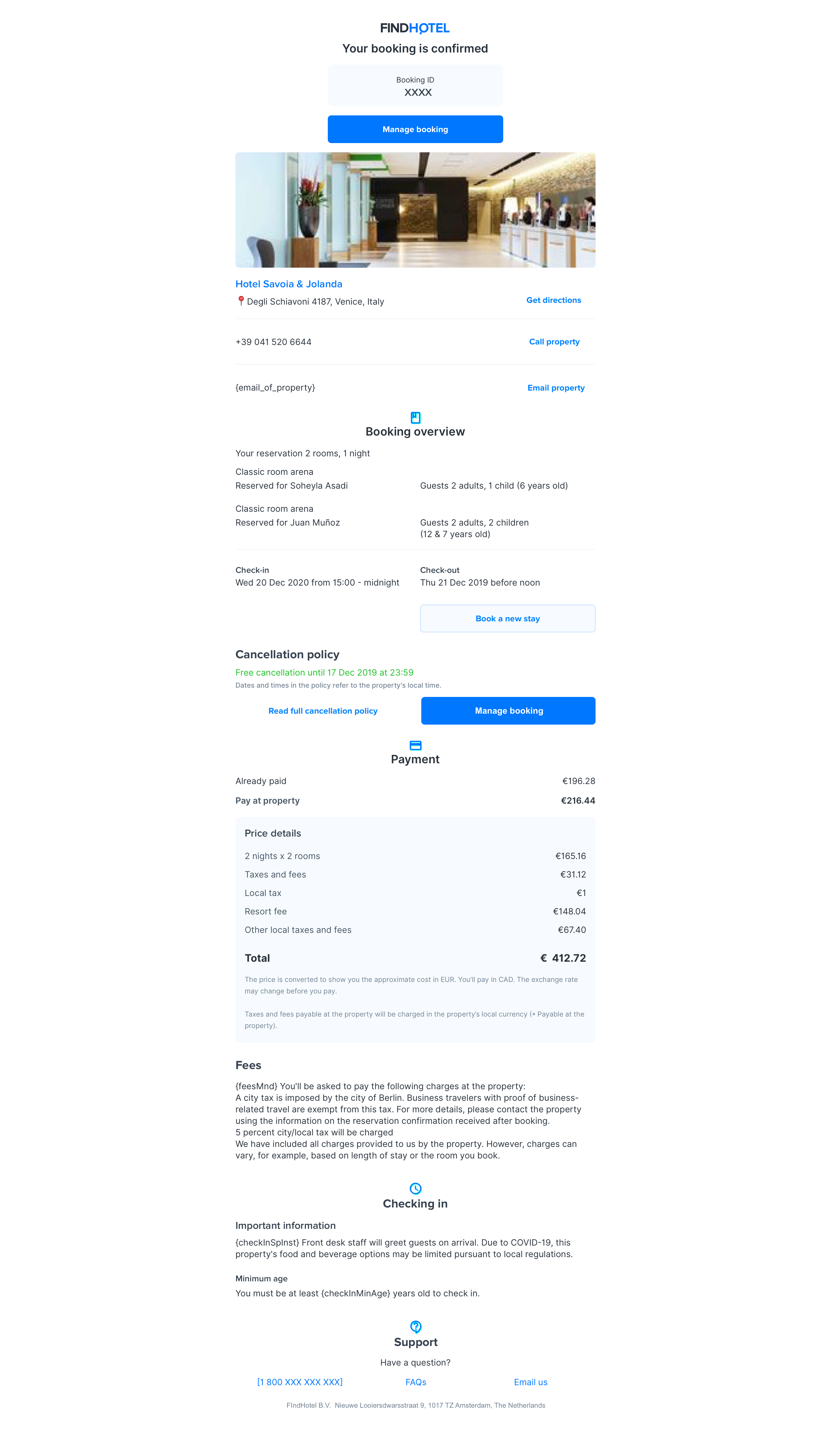
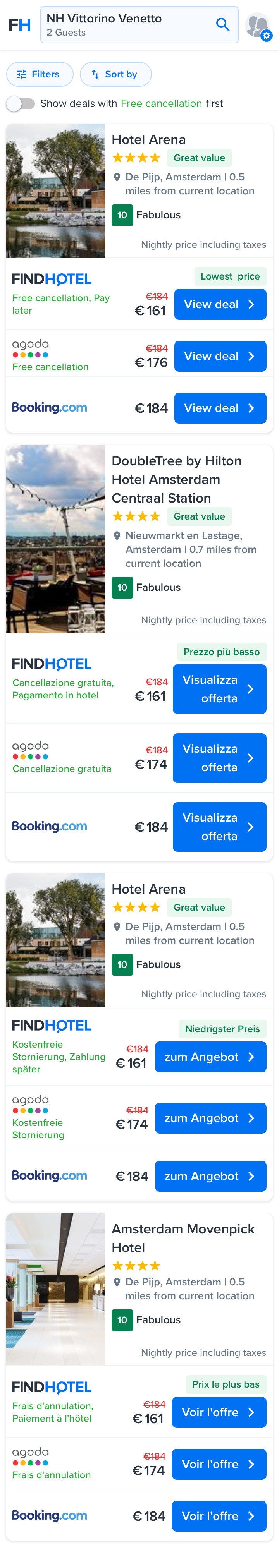
Example of pages created with the Findhotel’s design system
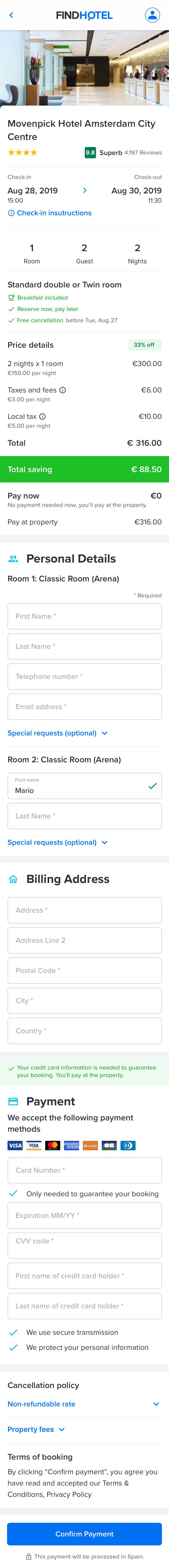
Checkout page (mobile)
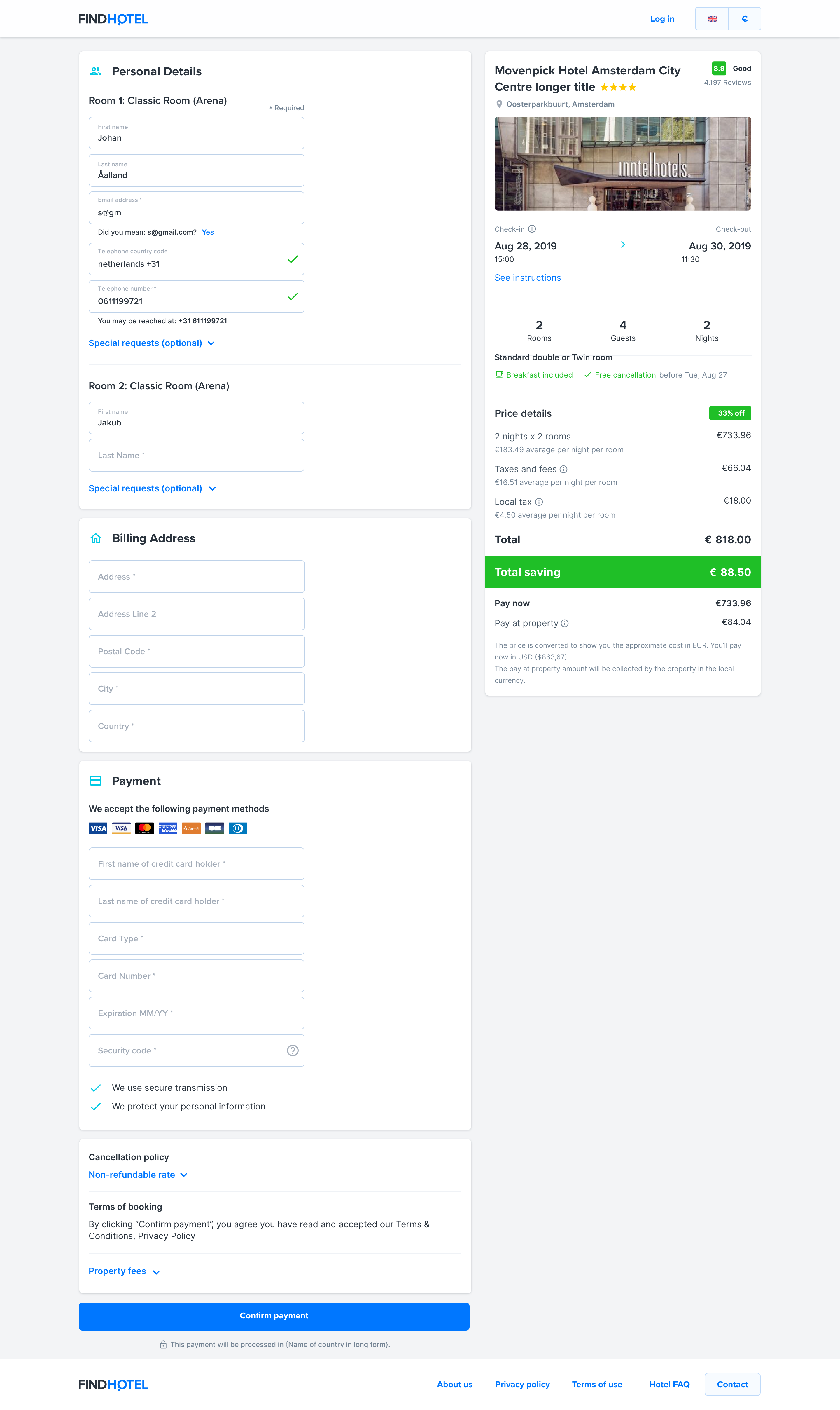
Checkout page (desktop)

Room selection page (mobile)
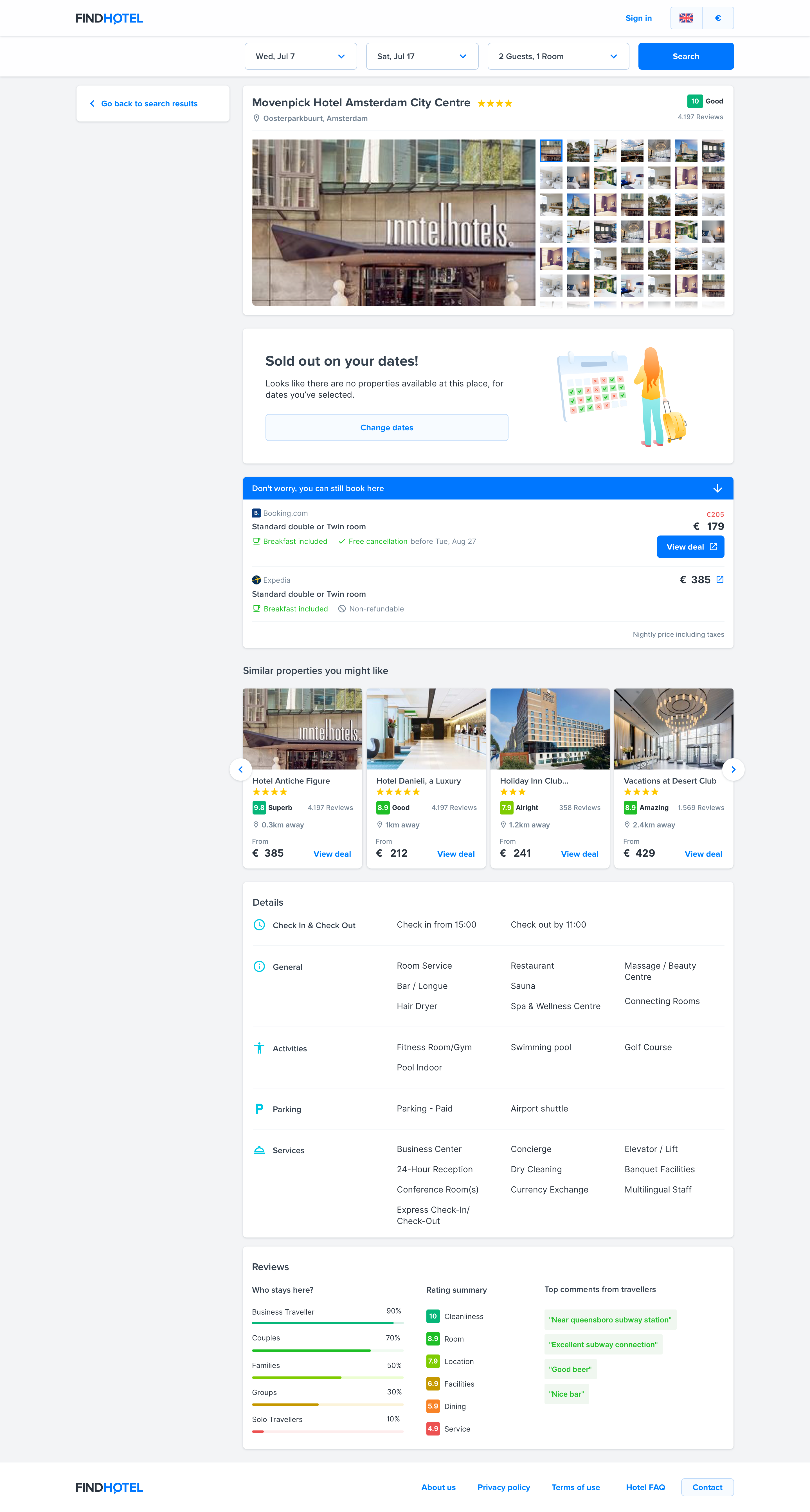
Sold out page (desktop)
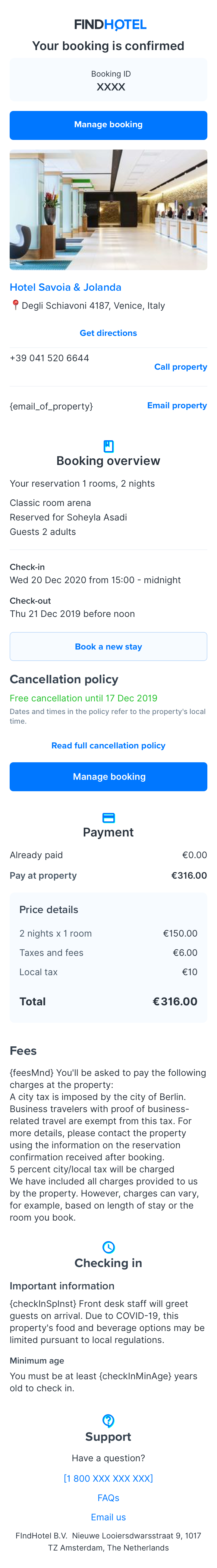
Confirmation email (mobile)
Confirmation email (desktop)
Search page (mobile)
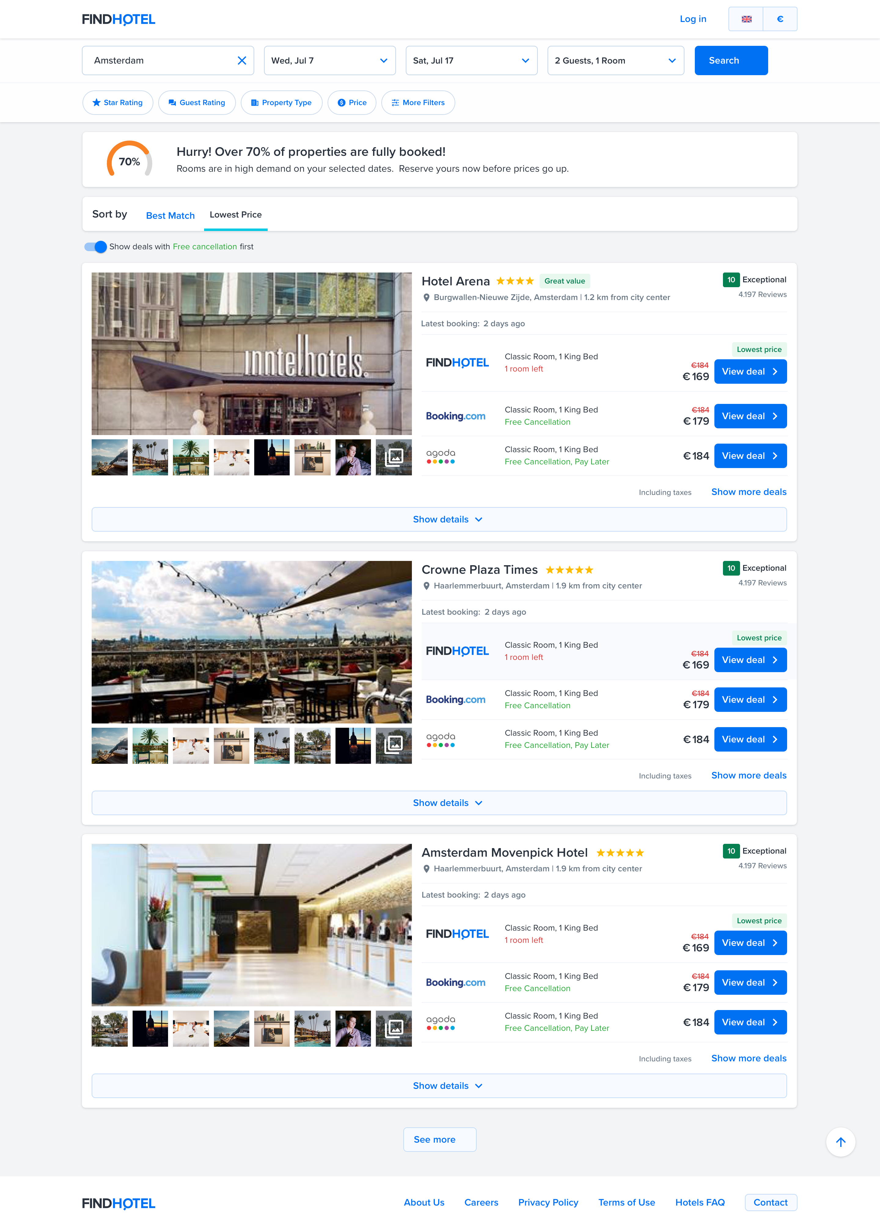
Search page (desktop)
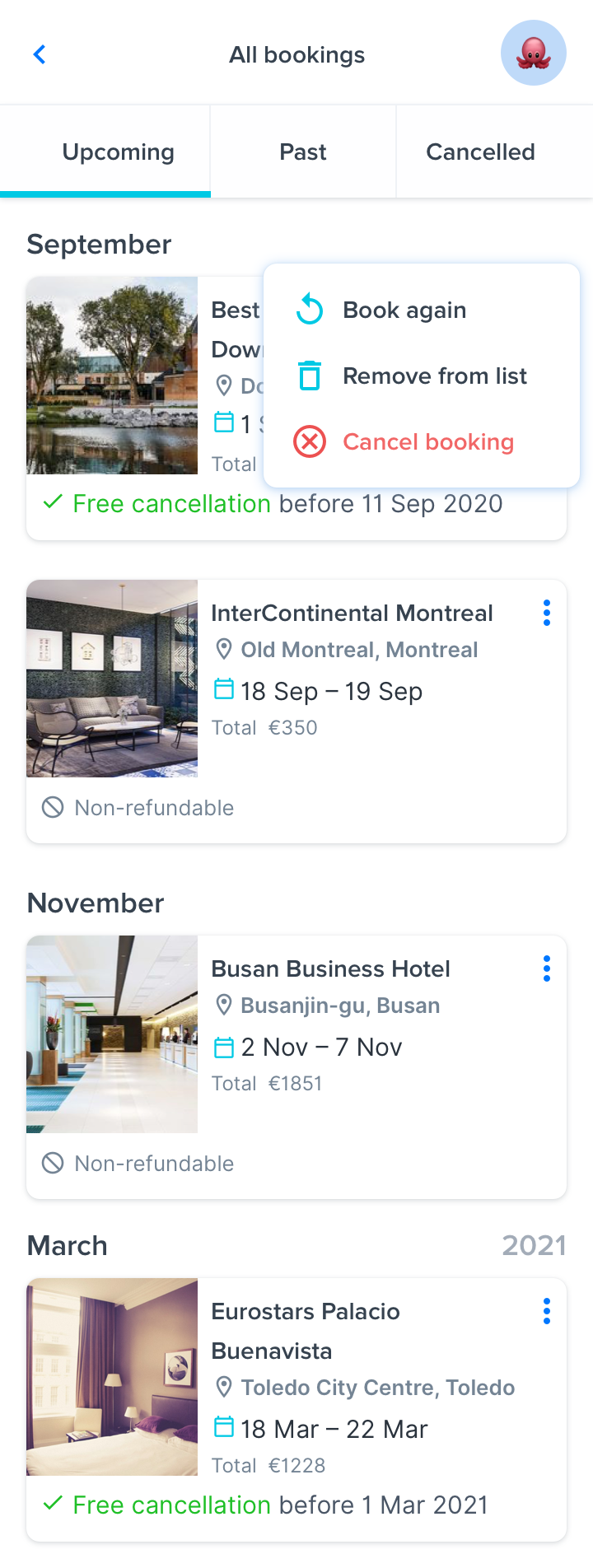
Itinerary page (mobile)
User menu (mobile)
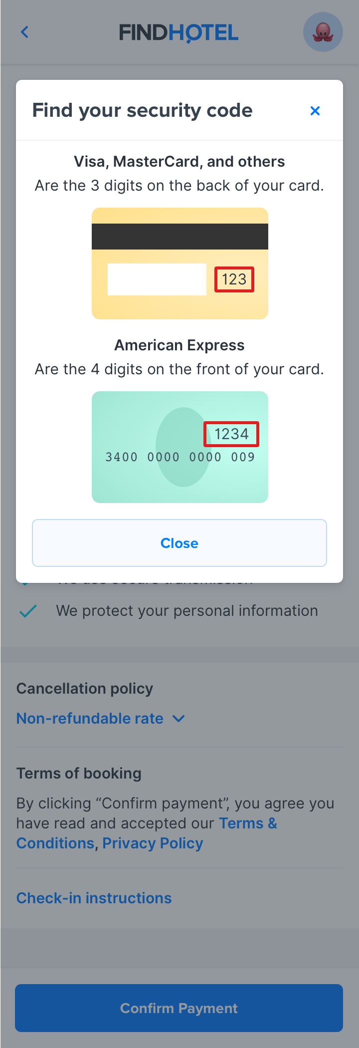
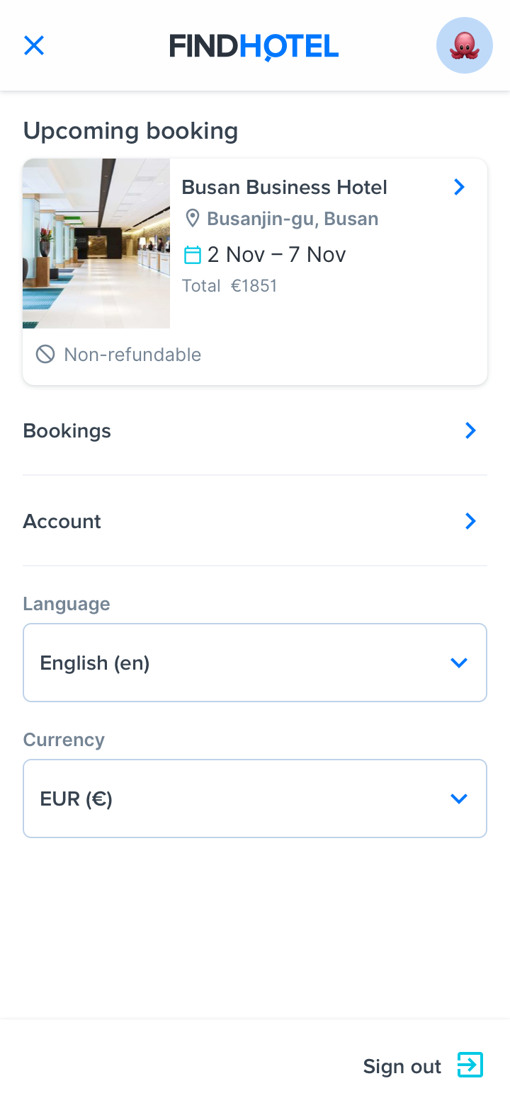
Credit card helper (mobile)
Payment/Checkout page (mobile)
Credit card helper tooltip
Room selection page
Search page (mobile)
Confirmation email
Payment/Checkout page (desktop)
Second step in Findhotel’s funnel, search
Room selection page when a hotel is sold-out
Room selection page when a hotel is sold out
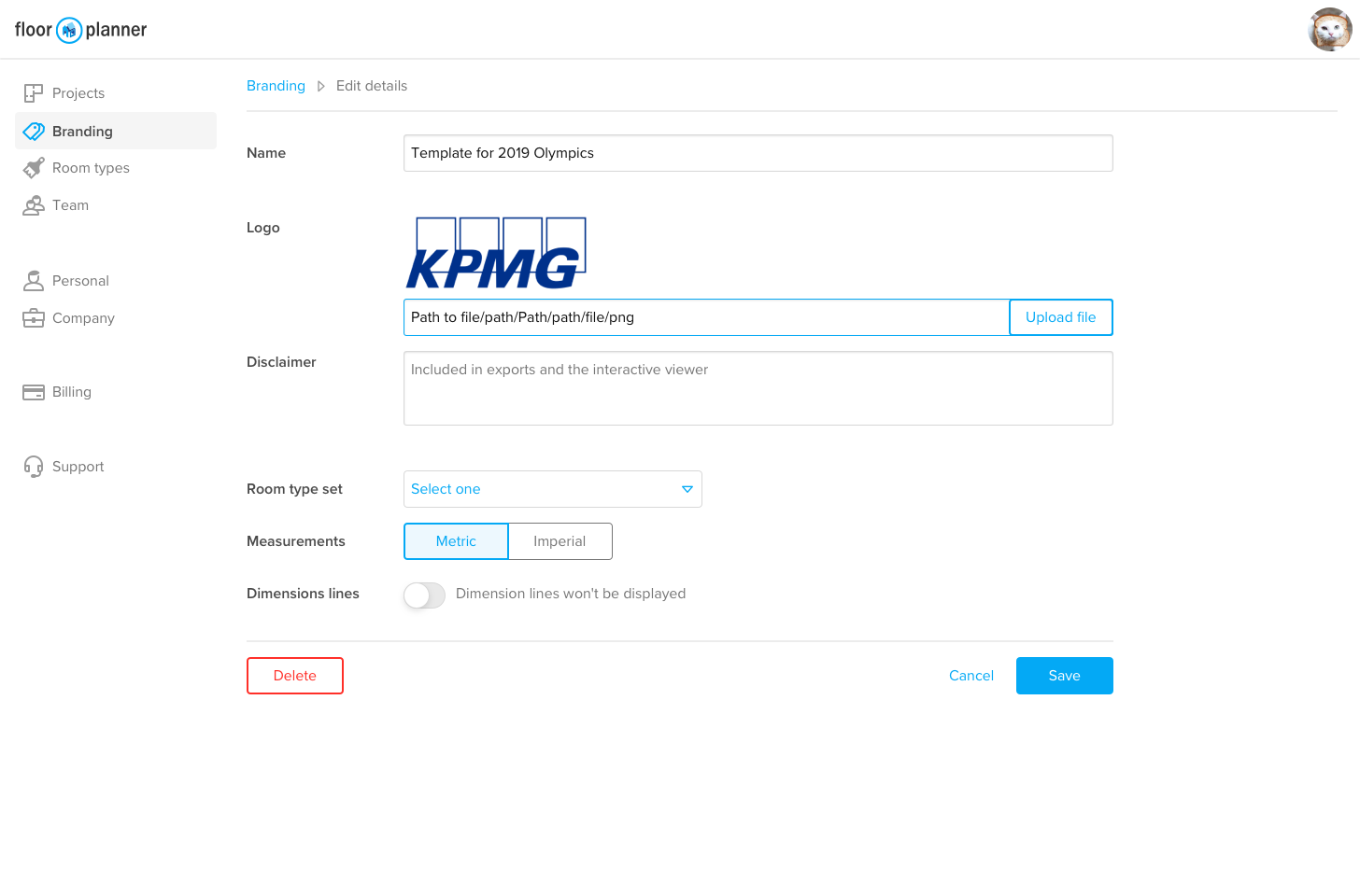
Example of pages created with the Floorplanner’s design system
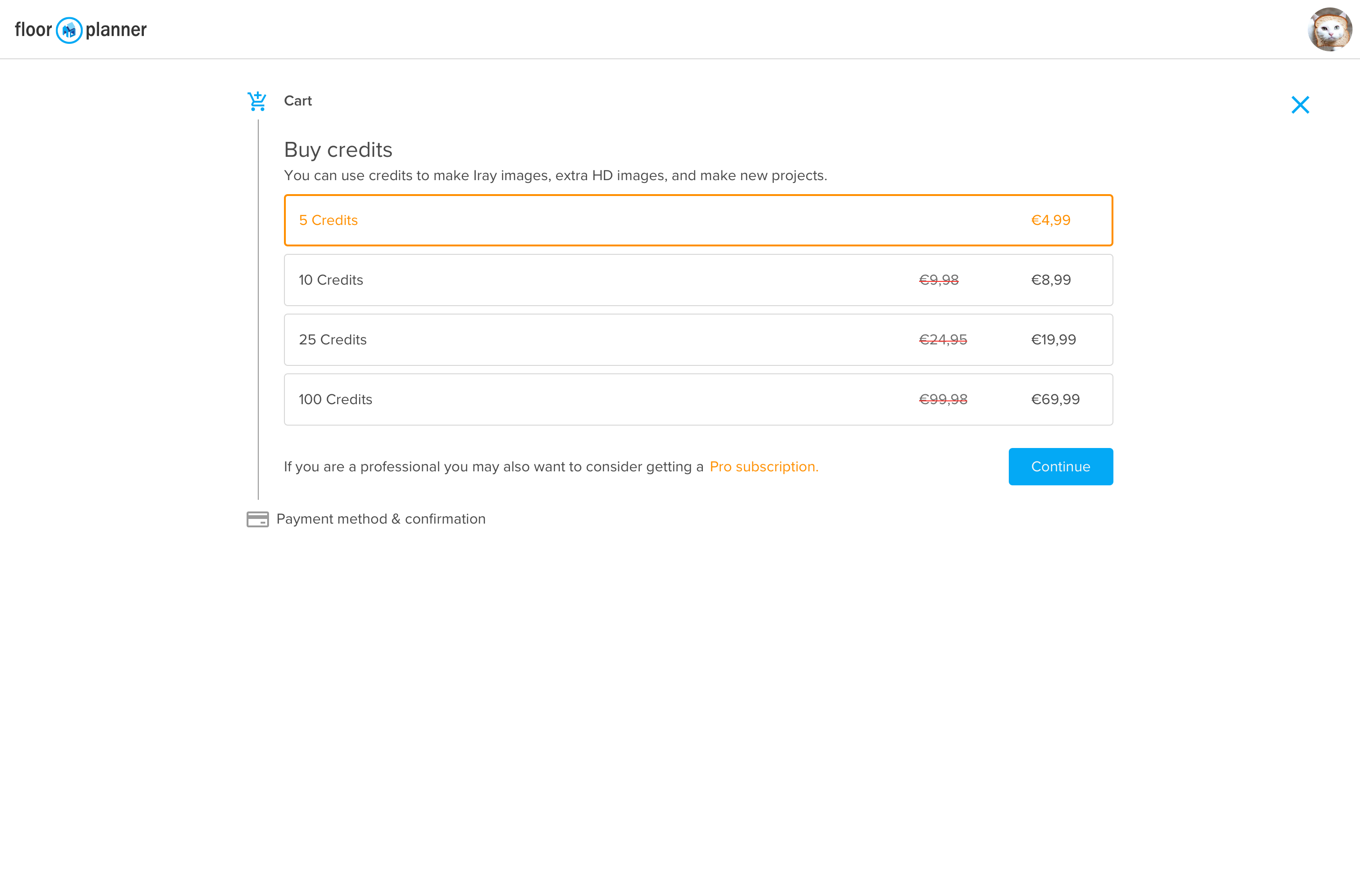
Checkout screen (first step)
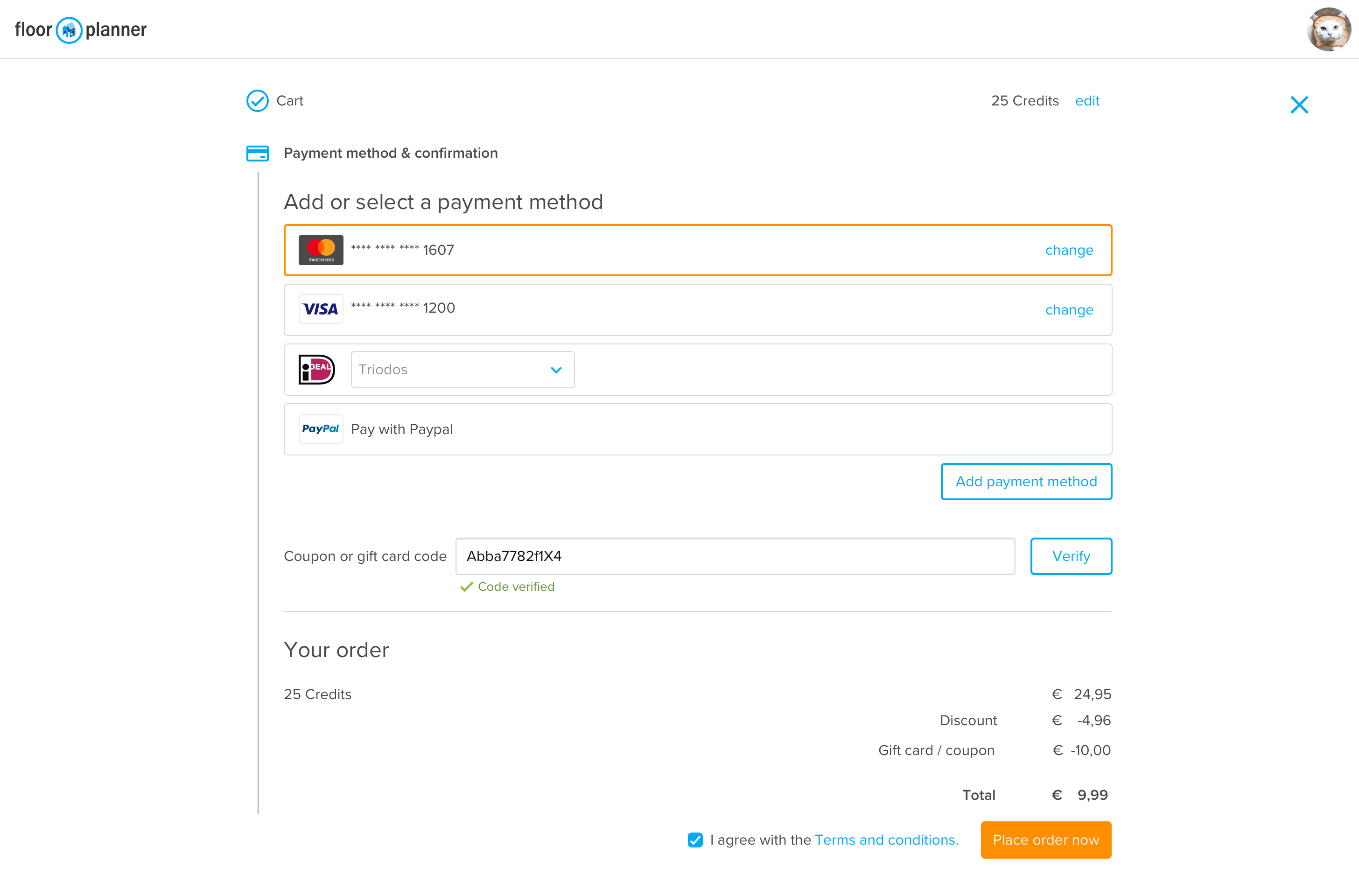
Checkout screen (last step)
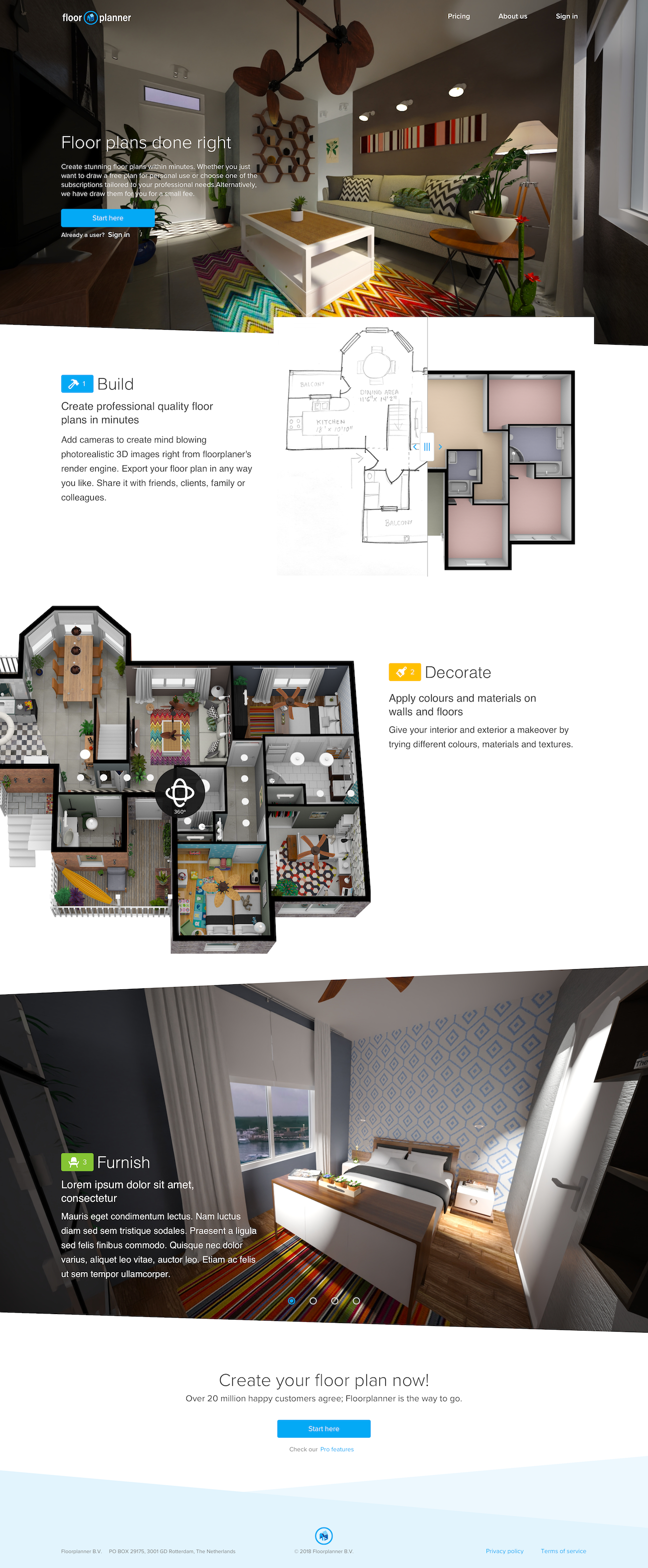
Landing page (new user onboarding)
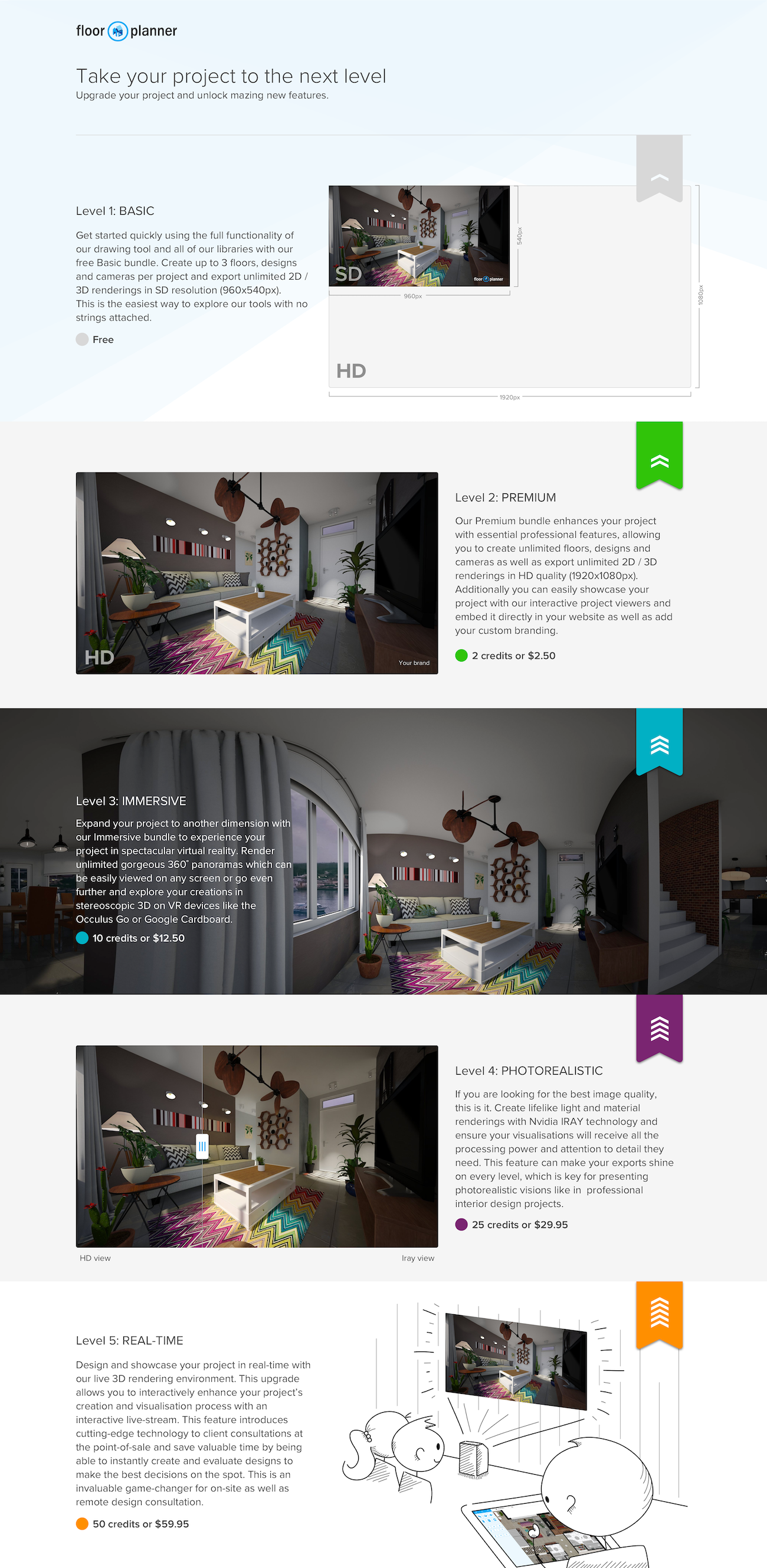
Features per plan page
Profile editing page
First step of the payment page
Last step of the payment page
Profile editor for pro users
Marketing page to onboard new users
Marketing page that displays the main features of each plan
Looking for me on LinkedIn?
Get to know me
Let's work together
I live and work in the Randstad area of the Netherlands (Amsterdam, Rotterdam, Utrecht, The Hague, Leiden, Delft, Harlem, etc).
For the SEO optimization guys. Thank you for your offers. But I am not interested in your services. This is a personal portfolio. I do not seek to have millions of visitors.