
Findhotel is one of the minor players in the room accommodation industry. Findhotel specializes in profitable localized markets that larger players like Booking, Expedia, TripAdvisor, etc, tend to ignore. Findhotel’s portfolio consists of distress deals. Meaning deals that hotels are likely to not sell, yet can’t be listed by the hotel directly for fear of being deprioritized by the bigger players in the industry.
UX Case study
Allowing users to pay later for their bookings
One of the key differences between Findhotel and other platforms is the possibility to pay later. From a business point of view, this is a no-brainer. However to be able to allow our users to pay later, we needed to build a strategy, acquire the portfolio of hotels, restructure how we handle bookings in general, and finally produce a flow for the users to be able to book pay later deals.
The main problem that “Pay later” as a feature had was that it could go in a thousand directions, there were a lot of opinions about how it should look, and what should be included in the MVP or not. Introduction of new features is always hard in IT departments with multiple scrum teams. But it is especially hard when the feature in question is predicted to have a marked effect in the conversion rate of the main product of a company. So something had to be done about all this.

Problem
Why this project?
Like many other projects, this was driven by both business interests, but also user needs. We suspected that the price that we displayed at the beginning of the funnel was not representative of what the user needed to pay at the end. We saw that there was an overall lack of transparency of what fees were charged and why.
Desired outcome
Our initial wish was to bring the feature live with the least amount of effort. We wanted to take a reliable approach that has been thoroughly tested by the industry (meaning other booking platforms). We knew up front that the feature would be widely accepted by our user base. But we did not know by how much. So we wanted to include a design that could be easily A/B tested, and had the least amount of changes in the flow. With a lean design/implementation and rapid testing, we would be able to see how impactful this feature would be to our overall platform. That in turn would allow us to justify further iterations. Since this was only a minimum viable product we expected to refine it further.
Audience
For who are we building this?
Because of our (frankly) archaic translation system. We decided to implement the feature only in English for the first weeks of the test. We expected the copy to be refined in several rounds. This meant that English speaking users would be able to see the entire flow in their language. But Korean, Thai, Danish, and other audiences would see all the terminology and copy of the “Pay later” feature in English while the rest would be in their corresponding language. At the same time, American users who speak English are by far our largest audience anyway. So it made sense to focus on them first.
Roles and responsibilities
Team’s setup
The business case and priorities were given to the team by our product owner, and the necessary data to make appropriate decisions, as well as designs of our A/B tests were given by our data scientist. The copy was provided by a dedicated copywriter. The translations of the copy were done by an external agency. The definitions of each step can be found in the chapter of Step by step description.
My responsibilities
The definition of each responsibility can be found below in the Process chapter. Among them include: Competitor benchmarking, Organising team ideation sessions, Organising scoping sessions, Wireframing, Generating a lo-fidelity prototyping, Guerilla testing, Creating a development plan, Aligning the copy with the objectives of the test, Producing Hi-fidelity screens, Generating a prototype of the happy flow, Testing, Probing after release, and Documentation for peers.
Scope and constraints
Limitations
As mentioned earlier the copy of the feature could only be properly tested in English to start with. Meaning that Japanese users would see English text next to the Japanese text. This resulted in an odd experience.
If a hotel supported Pay later, the search page should display that it did. However, due to the company structure, making changes in the search page was not possible for our initial test. As a consequence, the user would see hotels from Booking, Agoda, Expedia, etc. that supported Pay later in the search results, but not of Findhotel.
Another constraint that we had was to make minimal changes in the checkout page due to a technical limitation in its architecture. This meant that some of my preferred designs were not feasible for the minimum viable product. This meant that the only part where Pay later could be decided by the user was in effect the “Room selection page”. As a designer, this was a significant constraint since asking for the user for a payment schedule before accessing the checkout page was odd at best. Still what was important is to measure its initial impact to gain momentum and further refine the feature.
Scope of A/B test
Duration
We ran the test for 4 and a half weeks. Starting in the month of December 2020. The test covered the winter holiday periods in Europe and the Americas.
Audience
Both the A and B sides had an equal amount of exposure at 400 customers per day, totalling 800 a day.
Room offers
The test was limited to Expedia’s room portfolio since it was the only room provider integrated at the time.
Process
Step by step description
As mentioned earlier, this page only represents a snapshot of the entire evolution of the feature of Pay later as a feature in Findhotel. This is only the initial stage or the minimum viable product.
1. Scenario mapping
It consisted of creating a rough diagram of user interactions, and the possible outcomes that the user would encounter. The reason why this was done was to have a more complete development plan later on. As a designer, this was useful to address some edge cases preemptively. However, it could not cover every possible scenario imaginable.

2. Competitor benchmarking
In this particular project, I worked on making a competitor benchmark intended to analyse each major (and some minor) players in the field. The objective was to come up with a set of key findings to follow, recommendations based on industry trends, and areas of opportunity for future development. The benchmark had the side effect of being useful on making common-sense design decisions based on industry standards.
It is worth noting that during the competitor benchmarking process I stumbled onto many more questions that the team had about the industry and its approaches. Some of these questions can be found in the Appendix at the end of this page. This is only natural since seeing how others do it is exploratory by nature.

Competitor benchmark of Booking.com and Expedia. Both the biggest and most significant players in the hotel accommodation industry.
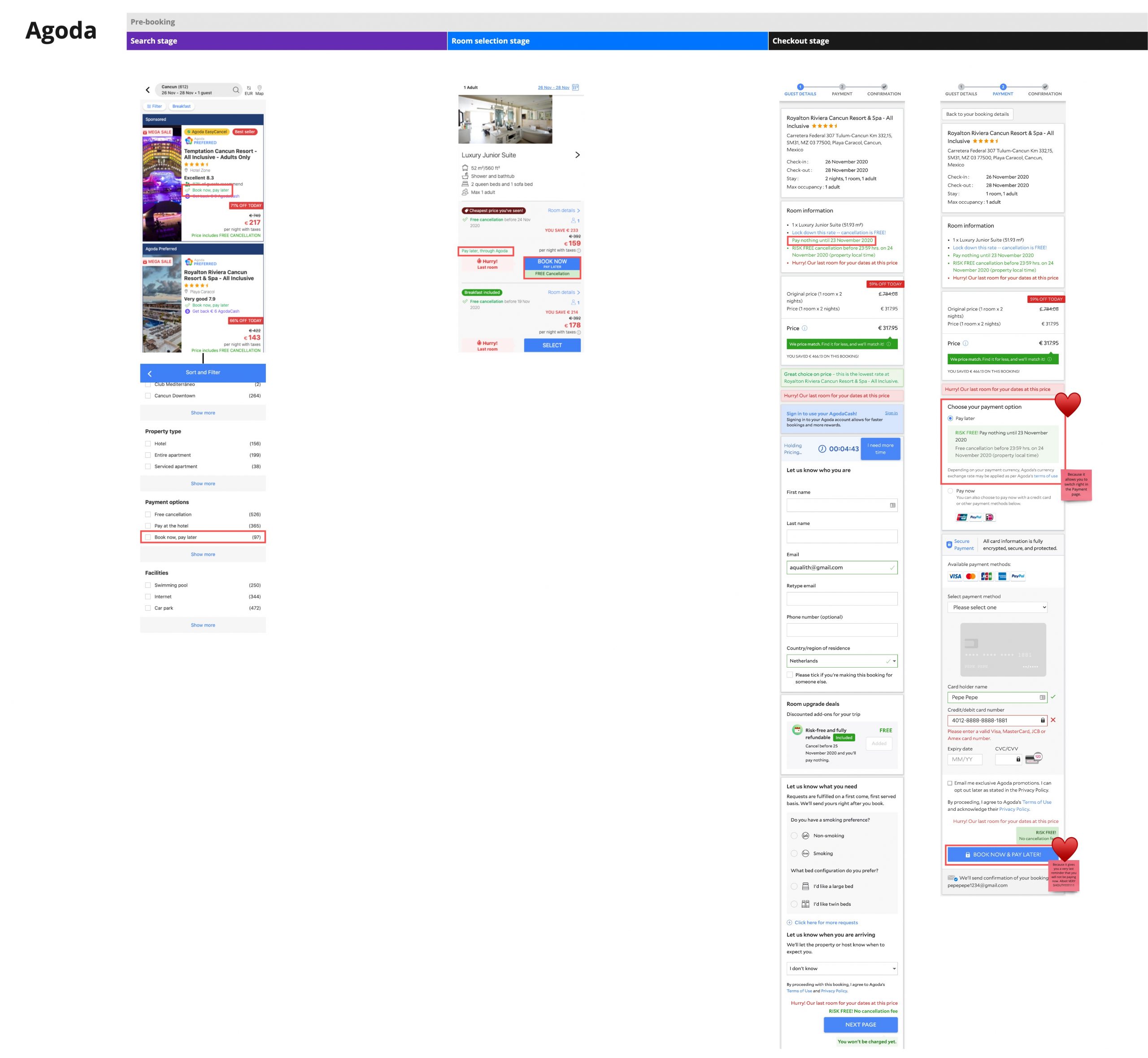
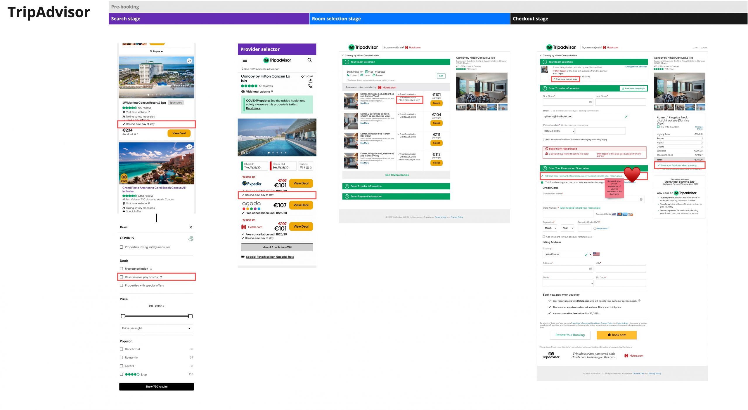
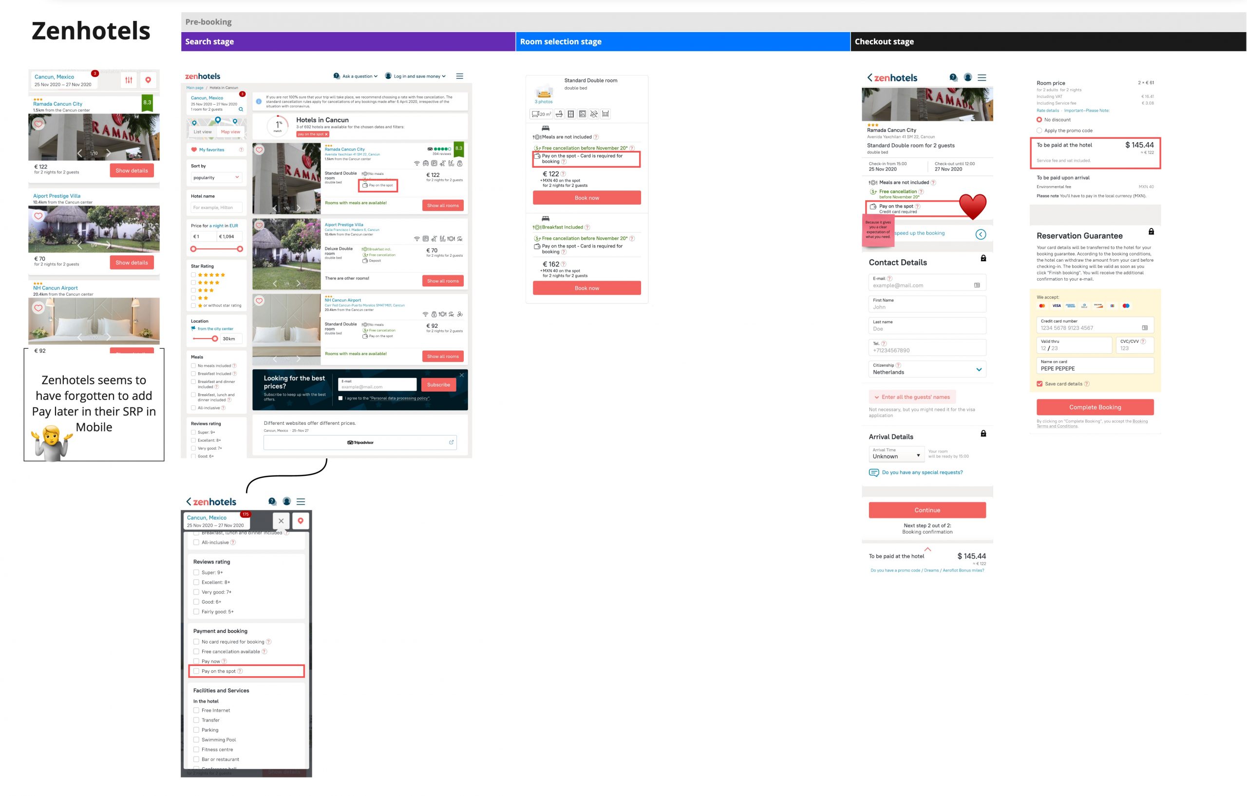
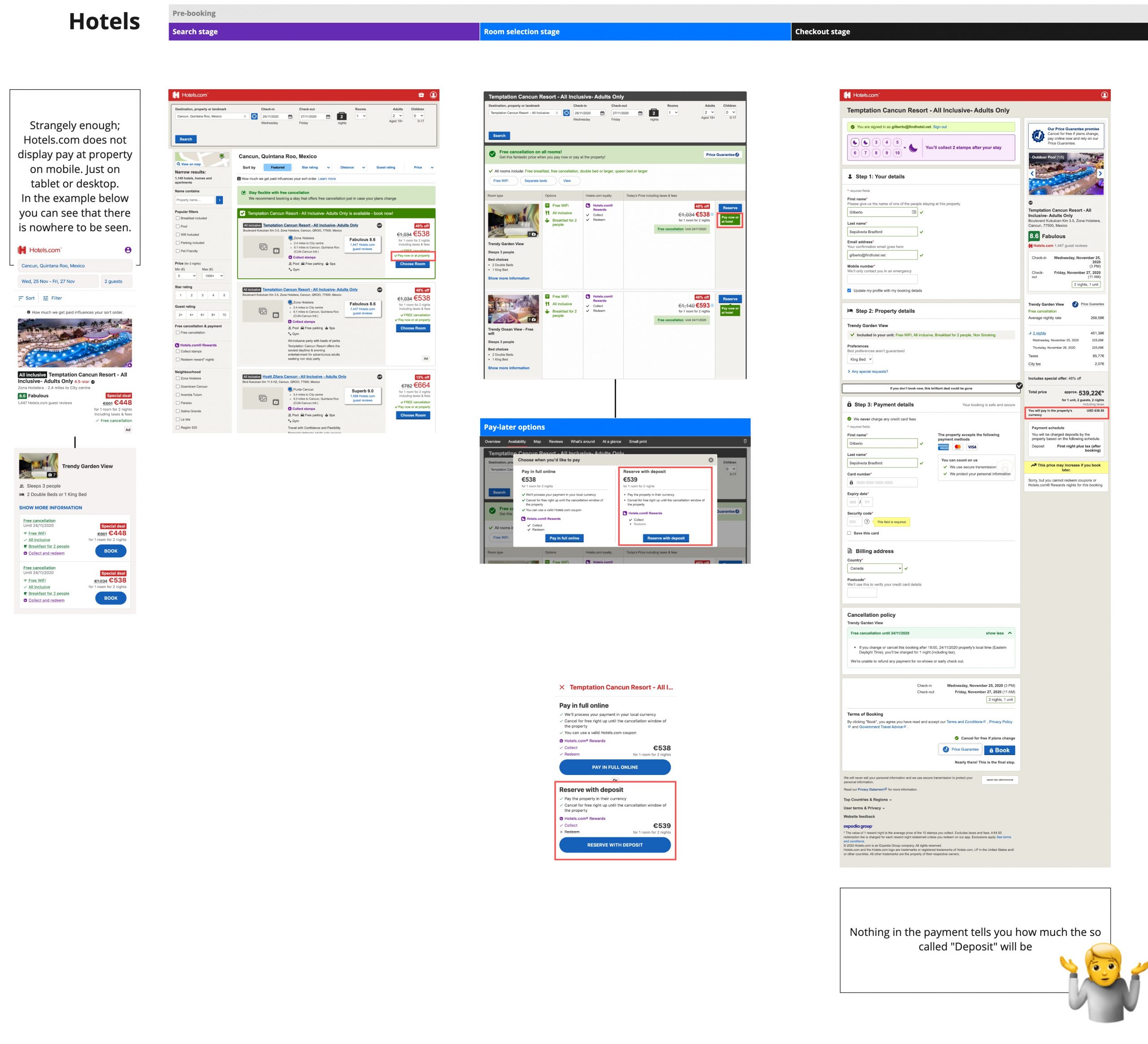
Competitor benchmark of other significant players in the industry, including Agoda, TripAdvisor, ZenHotels, and Hotels.com
3. Ideation sessions
As a UX designer, I was in charge of organizing ideation sessions with our team. The objective here was to familiarise the team with the solutions in the market based on the competitor benchmarking, and hopefully to come with a set of key priorities.

3.1. Scoping
Along with the ideation sessions, the team, product owner, data scientist and I worked on scoping the solution after each session. We wanted to define what an ideal solution would be, and what a minimum viable product would be.

4. Wireframing
As one would expect, I was in charge of creating the first wireframe which turned into a prototype of the concept itself. This artifact was meant to be used in the Guerilla testing step.
This also served to place two competing concepts into something clickable, and therefore have an early judgement from all the stakeholders involved.

5. Low fidelity prototyping
Doing this is a sub-step of wireframing. It was meant to generate an artifact that would display the concept of what we want to improve. Because of its low fidelity, it was meant to be used with stakeholders and anyone who had a business interest within the organization. You may click through the prototype here.
5.1. Guerilla testing
After generating the prototype, the guerilla testing was meant to weed out obvious issues with the concept, as well as generating questions from stakeholders. Many of these questions had to be researched by different members of the team.
6. Creating a development plan
A diagram consisting of the happy path, as well as the main edge cases, was created along with their corresponding screens. This enabled the product owner and developers to begin writing tickets for the sprints to come.

7. Producing Hi-fidelity screens
After the creation of the development plan, and the creation of tickets by the product owner and team members. I ventured to produce the Hi-fidelity screens that would match the style guide and the component library of Findhotel. This was done so front-end developers can produce the layouts with correct paddings, colours, margins, icons, etc. The key screens in desktop and mobile were published in Zeplin for developers to use.
")


8. Testing
After developers have implemented an unreleased version of the solution. I would often manually test the user scenarios that we agreed to be in a sprint. The scenario mapping and the scoping diagrams served well in this step to make sure that all scenarios are properly tested. Apart from the scenarios our team actively tested for the following criteria (when applicable).
- Device: Mobile vs Tablet vs Desktop
- Browsers: Chrome vs Safari vs Firefox vs Edge
- Stay length: Single night vs Multiple nights
- Room configuration: One room vs Multiple rooms
- Signed status: User signed in vs Not signed in
- Private deals: Room with private deals vs No private deals vs Mixed
- Availability: Available vs Sold out vs Price mismatch
- Tax display logic: No taxes included (US) vs Taxes included (NL)
- Price payment breakdown: Prices with pay at property taxes/fees vs Pay now only prices
- Price currency conversion: Provider currency converted prices vs Unconverted currency prices
- Language-based UI issues: English vs German (longer words)
9. Probing after release
This step is meant mainly to check how users interact with the solution in production. For this step, I made extensive use of FullStory. FullStory is a comprehensive tool that allows me to see the real user interactions on the website as well as segment users by particular actions or demographics.
If I detected an issue, bug or idea for the future, I would document it. Occasionally bugs slip away, as well as strange interface manifestations in specific browsers. This was a very useful tool to spot the issue, and then document it for further work.
Taiwanese customer using the Pay later functionality (desktop)
Taiwanese user going through the booking flow while using the Pay later functionality on the A Side of the A/B test. (This is a video so it may take a few seconds to a minute to load).
Indian customer using the Pay later functionality (desktop)
Indian user going through the booking flow while using the Pay later functionality on the B Side of the A/B test. (This is a video so it may take a few seconds to a minute to load).
American customer using the Pay later functionality (phablet)
Customer from the US (Ohio) is on the B side of the A/B test using the Pay later functionality. (This is a video so it may take a few seconds to a minute to load).
Qatari customer using the Pay later functionality (mobile)
Qatari user going through the booking flow while using the Pay later functionality on the A Side of the A/B test. (This is a video so it may take a few seconds to a minute to load).
Spanish customer using the Pay later functionality (tablet)
Spanish user going through the booking flow while using the Pay later functionality on the B Side of the A/B test. (This is a video so it may take a few seconds to a minute to load).
10. Documentation to peers
Last but not least, was to create an easy to read version of the development plan (mentioned earlier). This step was meant to spread the knowledge of other colleagues within the organisation. While the PO and Data scientist would ensure to document the readable content, I would make sure to create visuals that would contrast the difference between Side A and the Side B on the test. In this way, the reader (a colleague in the organisation) could simply browse through the page and understand quickly what was changed.


Conclussion
Results
There was a 4.2% conversion increase in Expedia (EPS) offers which was the only provider that was integrated for the A/B test. The conversion increase already takes into account the higher cancellation rate.
Unfortunately, a bug in the search page affected the conversion results because only the top 3 providers would be shown per hotel listing. Findhotel’s pay later offers weren’t always in the top 3 listings.
The cancellation rate in Pay later offers turned out to be about 3.3% higher than the Pay now offers. Although fixing the bug (mentioned previously) is likely to change this number.
Learnings
The error rate in the checkout form of Pay later was significantly larger than when the user decided to Pay now. We suspect that the CTA of the checkout button ‘Confirm Payment’ and the management of expectations was the reason.
The bug in the search page had a large negative effect on the results. It is very likely that Pay later offers are more attractive than the results suggest; however if the user can’t find them conversions can’t happen. Nonetheless the Pay later initiative had a net conversion benefit.
Looking for me on LinkedIn?
Appendix
Appendix; the extra bits
This is the part where the research branches out
The following material is not precisely necessary to understand the central issue that we wanted to fix. However, it includes interesting material that lead me to make certain design decisions in the interface. Some of this material will come useful as we evolve the experience of our customers. But because I have a lot to show, I ought to find a place for it.
How does a mature platform like Expedia process its bookings?
Our technical architecture was using Expedia’s data for the minimum viable product. So we had to conform to their standards as FIndhotel sells some of their portfolio. For this reason, I decided to dive into the rules of booking processing of Expedia. The diagram below is a representation of the decision flow of the system for non-technical people. This was also meant to help developers to navigate the complex sub-features that we were and weren’t going to implement in the first version of the implementation.

Get to know me
Let's work together
I live and work in the Randstad area of the Netherlands (Amsterdam, Rotterdam, Utrecht, The Hague, Leiden, Delft, Harlem, etc).
For the SEO optimization guys. Thank you for your offers. But I am not interested in your services. This is a personal portfolio. I do not seek to have millions of visitors.