

Coolblue, a leading electronics retailer in the Netherlands and Belgium, is renowned for its exceptional customer service and playful marketing style. During my time there, the company was undergoing a significant transformation, modernizing its backend systems to streamline operations and enhance efficiency.
UX Case study
Streaming restocking decisions
Coolblue faced a critical challenge: its restocking process was slow, unreliable, and inefficient. The root of the problem lay in the cumbersome decision-making process for buyers.
To restock an item, buyers had to gather and analyze 17 distinct data points, many of which were difficult to access in the outdated system. This manual process, involving data collection, spreadsheet calculations, and manual input, consumed 30 to 45 minutes per decision.
As a result, many products were not restocked in a timely manner, and those that were often faced overstocking issues, leading to wasted warehouse space and increased risk.

Problem

The main issue we tried to resolve
Having a product sold out is not only frustrating for the user but also has a significant impact on the brand.
Why this project?
Our business analysts identified the slow and unreliable restocking process as a major obstacle to revenue growth. Frequent product unavailability hindered our ability to compete in the market and maximize sales.
Desired outcome
We had 3 overarching goals in mind:
- Increase the frequency: Ensure products are replenished more frequently.
- Reduce overstocking: Minimize excess inventory to optimize warehouse space.
- Automate easy decisions: Streamline the process for routine restocking tasks.
Our team aimed to optimize the restocking process by increasing product availability, reducing excess inventory, and automating routine tasks. By creating a learning system that could handle common restocking decisions, we sought to free up buyers’ time for strategic initiatives like long-term planning and supplier negotiations. This would not only enhance efficiency but also mitigate the risks associated with human factors, such as memory lapses or turnover, which can negatively impact stock availability.
For example: making sure to secure a stock of barbecues in black, red and green in the winter so they can sell them in the summer of next year. This is an example of how the skills of a buyer can be better applied since it requires active communication with manufacturers, negotiation about price, signing of deals, etc.
Additionally, we wanted to lessen the burden in the memory of a buyer. People grow, move to other companies, get sick, forget things. All these circumstances hinder the performance of stock availability in a store.
The main issue we tried to resolve
Having a product sold out is not only frustrating for the user but also has a significant impact on the brand.
Audience
For who are we building this?
While a well-stocked store directly benefits customers, this tool was primarily designed for Coolblue’s employees, specifically the buyers responsible for managing restocking orders. Each buyer was equipped with a standard desktop PC, complete with a monitor, mouse, and gamepad controller.
Roles and responsibilities
Team’s setup
The team comprised one front-end developer (XAML for Windows applications), one product owner, three back-end developers (.NET), and a UX designer (me).
The application was designed to run exclusively on Windows desktops, aligning with the company’s supported hardware configuration.
My responsibilities
As the first UX designer to delve into Coolblue’s back-office systems, I had a broad range of responsibilities. I had to gain a deep understanding of the business operations, partner dynamics, and the specific needs of restocking buyers. Additionally, I engaged with stakeholders to gather their perspectives and understand the factors influencing their decisions, including the significant influence of the CEO.
Scope and constraints
Limitations
Rather than A/B testing, we evaluated the product’s performance using key business metrics. Given the relatively small user base of 12-24 individuals, it was feasible to conduct qualitative / exploratory research, such as user interviews, with all users.
Process
Step by step description
This text reflects the state of the product during my time at Coolblue. I believe it has evolved significantly since then. For example, the original version was designed for Windows desktops, whereas Coolblue has transitioned to a web-app model.
1. User interviews
As a pioneer in UX design for Coolblue’s back-office systems, I initiated this project before a dedicated product owner was appointed. To gain a comprehensive understanding of the business processes, I conducted interviews and observations with various Coolblue employees. Through this research, I familiarized myself with the company’s internal logistics, customer experience goals, and the intricacies of the restocking processes.

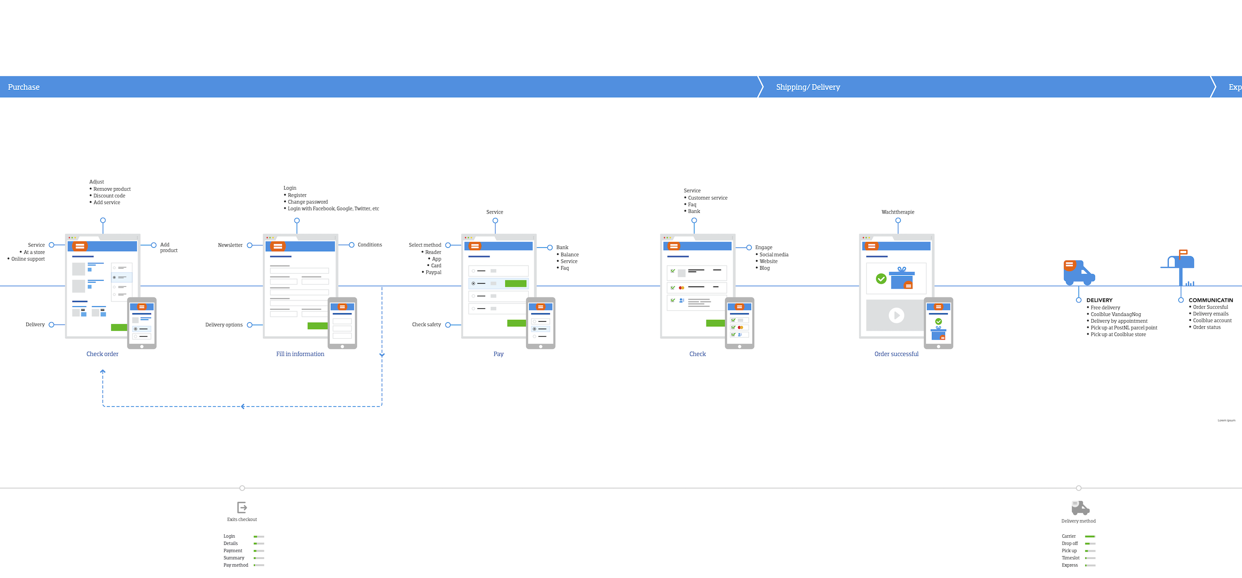
Pre-checkout
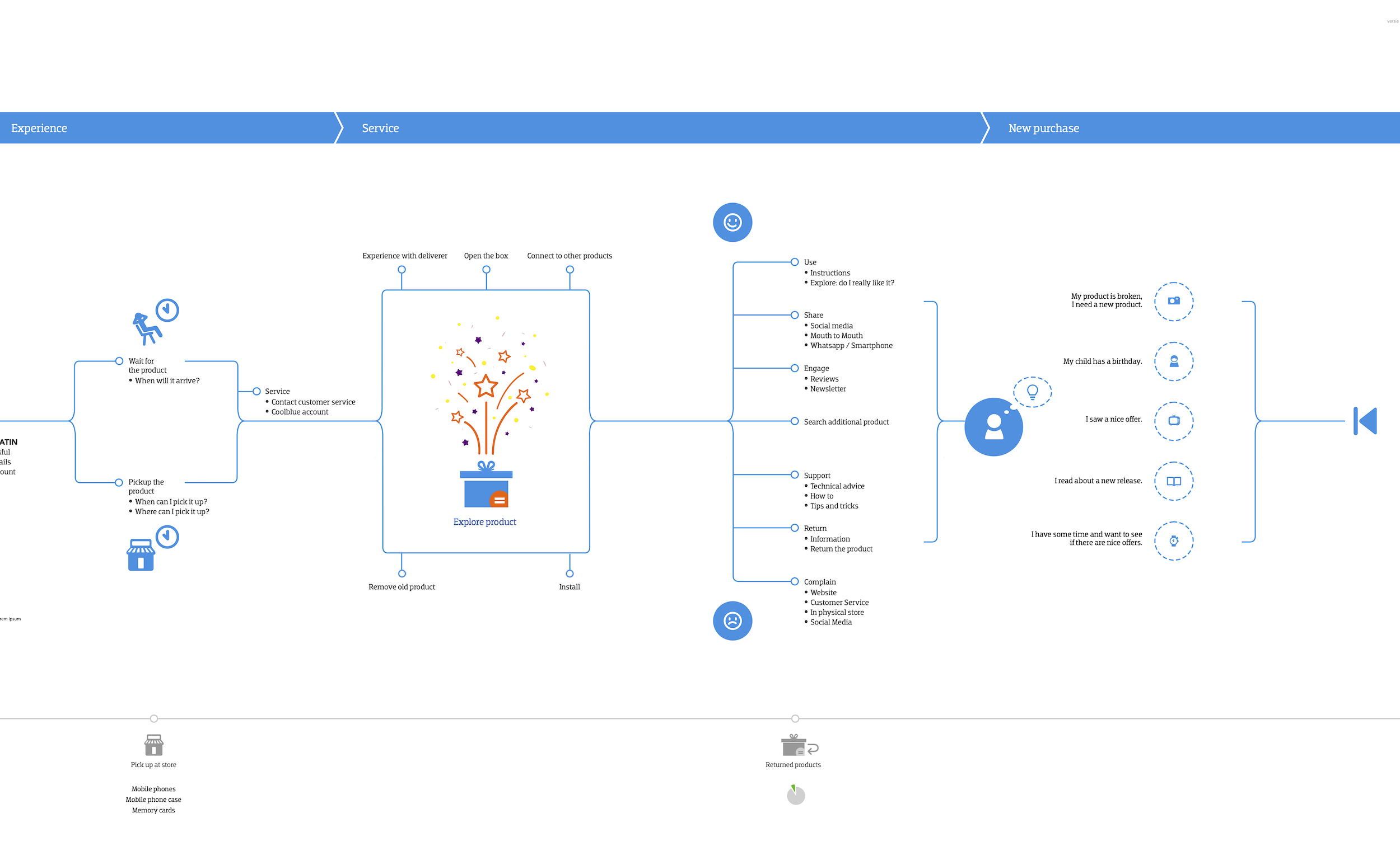
Post-checkout
Shipping & Returns
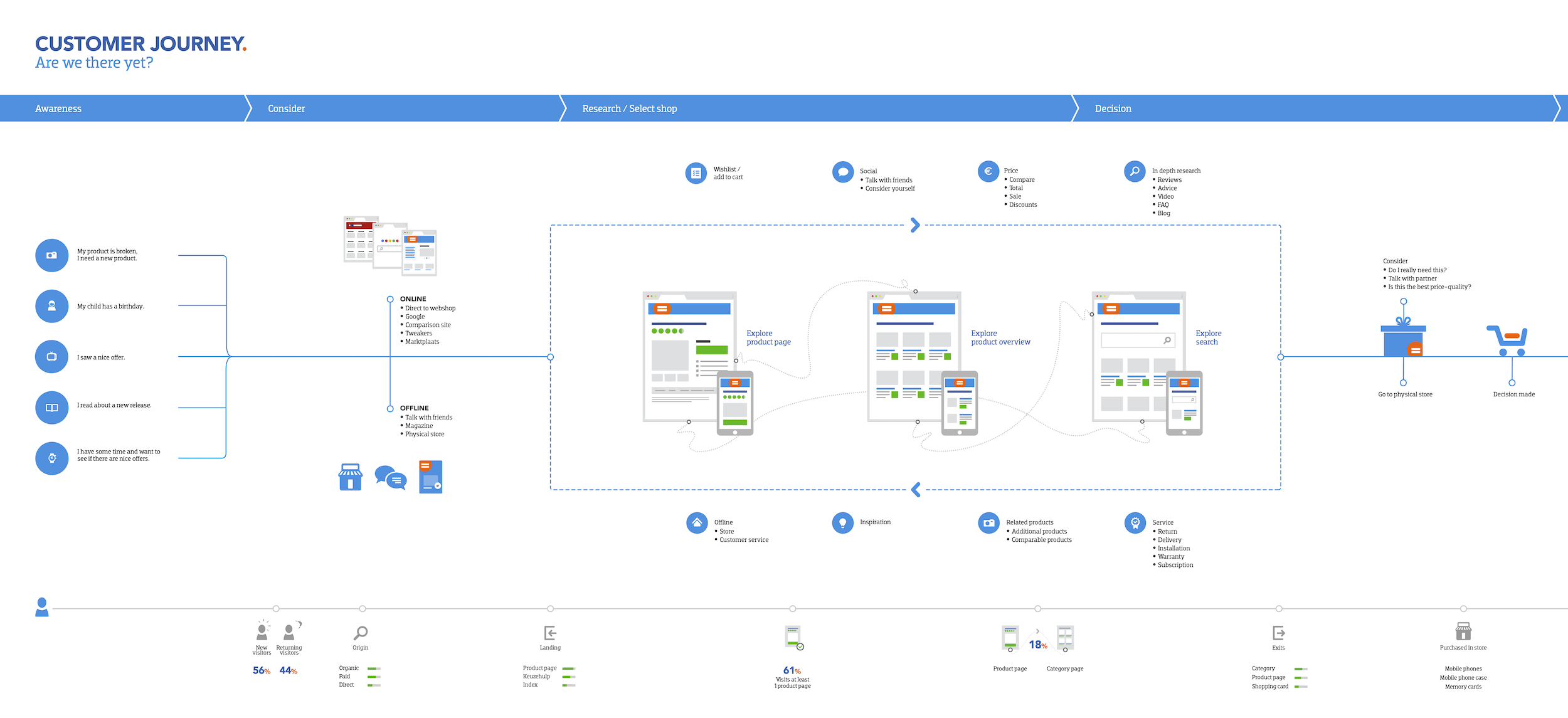
Customer journey map
The image illustrates the complete customer journey, from initial consideration to purchase. This visual representation helps guide customers through the buying process, even before they actively engage with the product.
.
2. Work as them
To gain a practical understanding of the process, I role-played as a buyer, using the existing tools to place orders. Through this hands-on experience, I gained valuable insights into the intricacies of the decision-making process, identifying three key factors that influence buyers’ choices.
- Should I restock now?
The software determined the need for restocking by identifying products with low stock levels. To assist buyers in making restocking decisions, the system presented relevant information. - If yes, how much should I restock?
The optimal restocking quantity was influenced by factors such as available warehouse space and supplier stock levels, which were not always readily accessible. Some suppliers provided real-time stock information, while others did not. Additionally, contractual agreements and delivery lead times varied among suppliers. - Can I restock from my selected supplier?
This depends on the points mentioned above, contracts, delivery time, stock transparency.
The feasibility of restocking from a specific supplier depended on these factors, including contract terms, delivery times, and stock transparency. To gain a better understanding of warehouse limitations and existing tools, the team conducted two on-site visits to the warehouses.
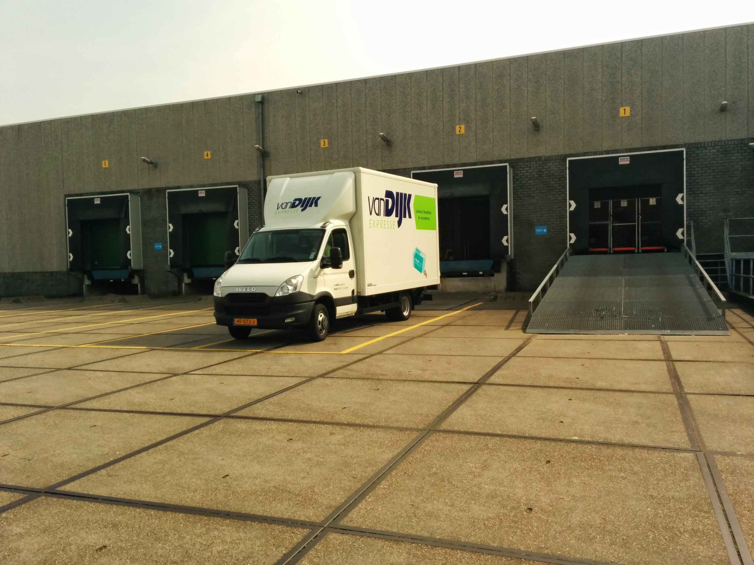
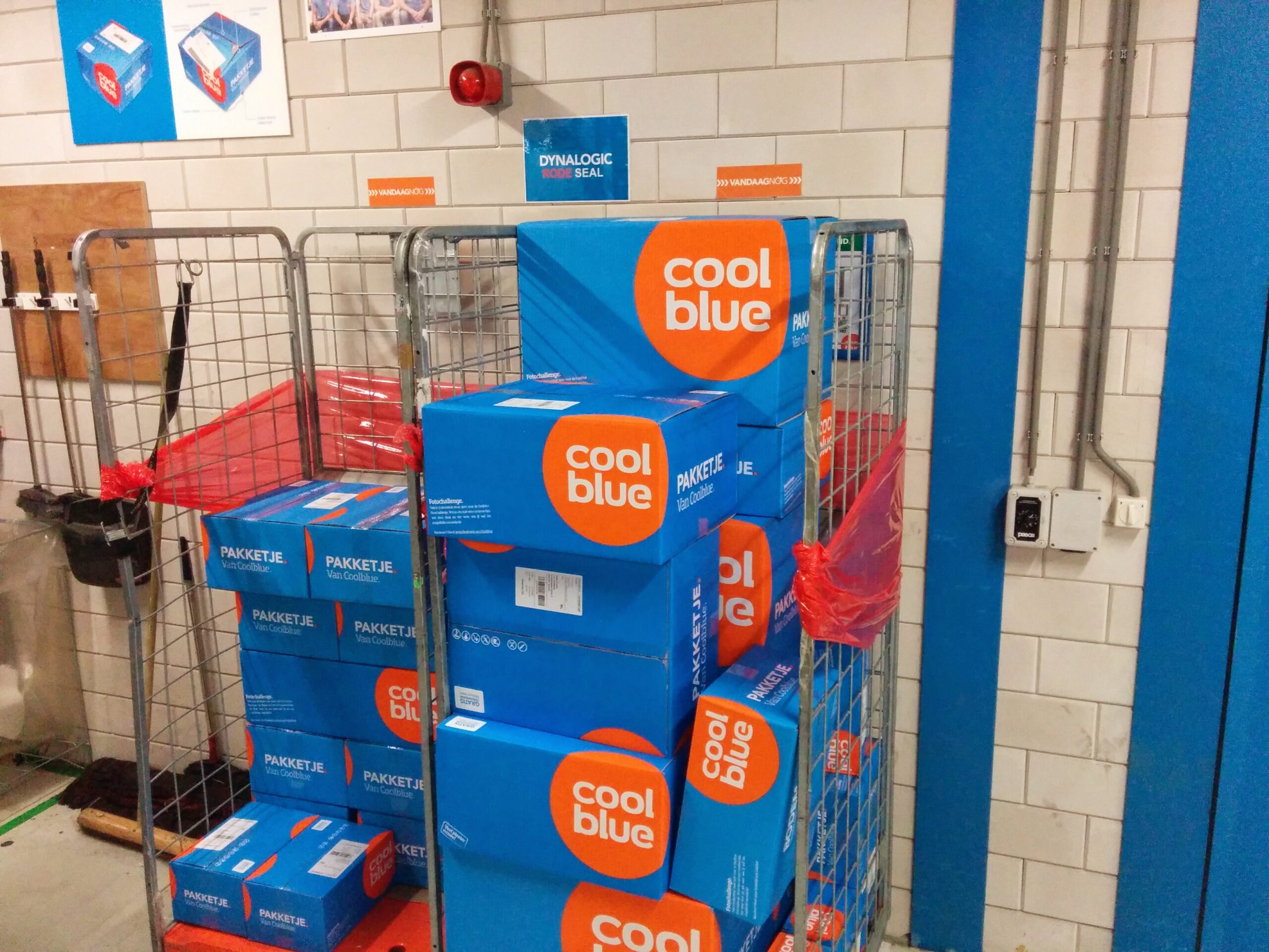
Supplier loading incoming goods
Part of the fulfilment process.
Products being registered for availability in store
Part of the fulfilment process.
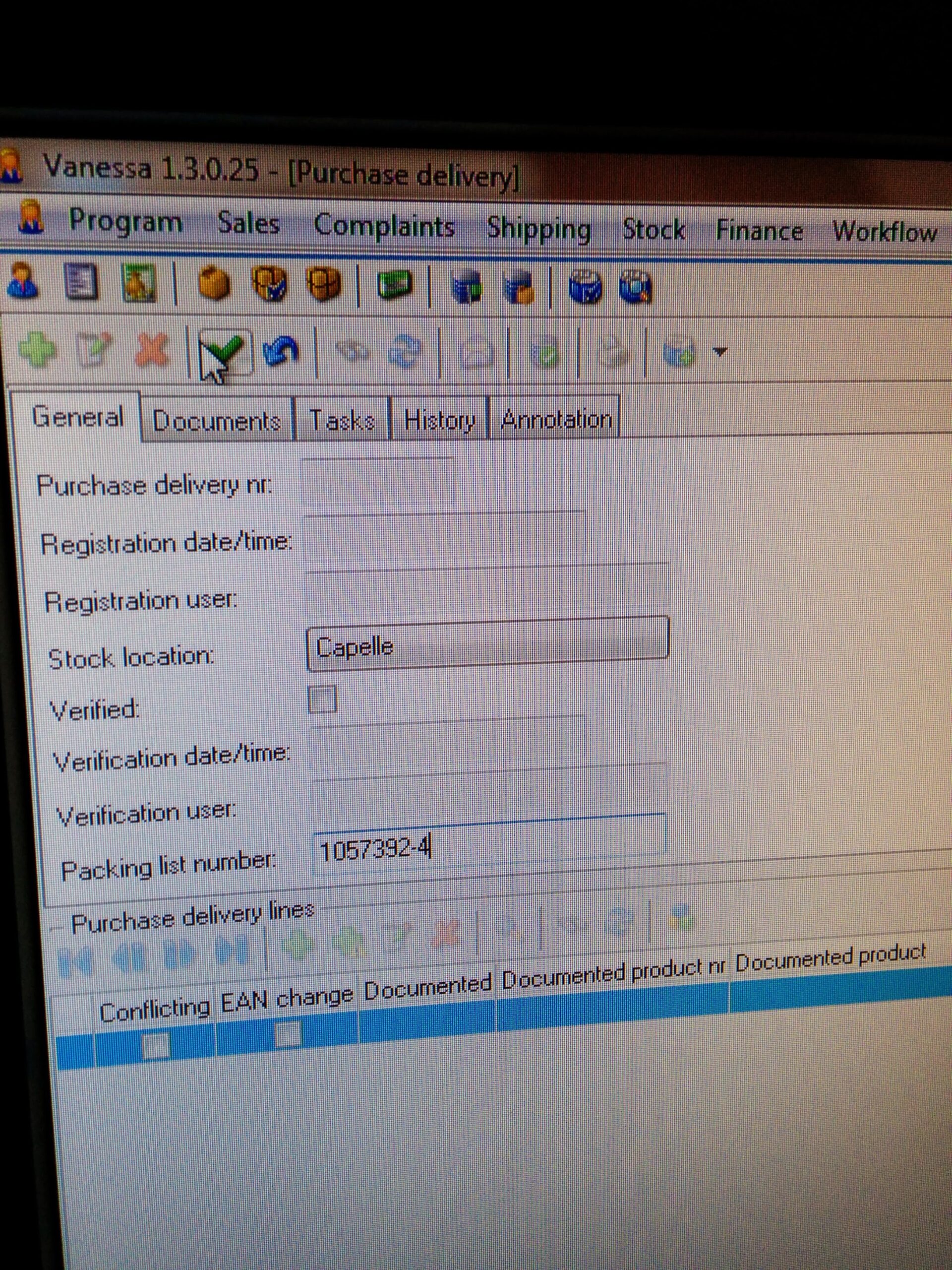
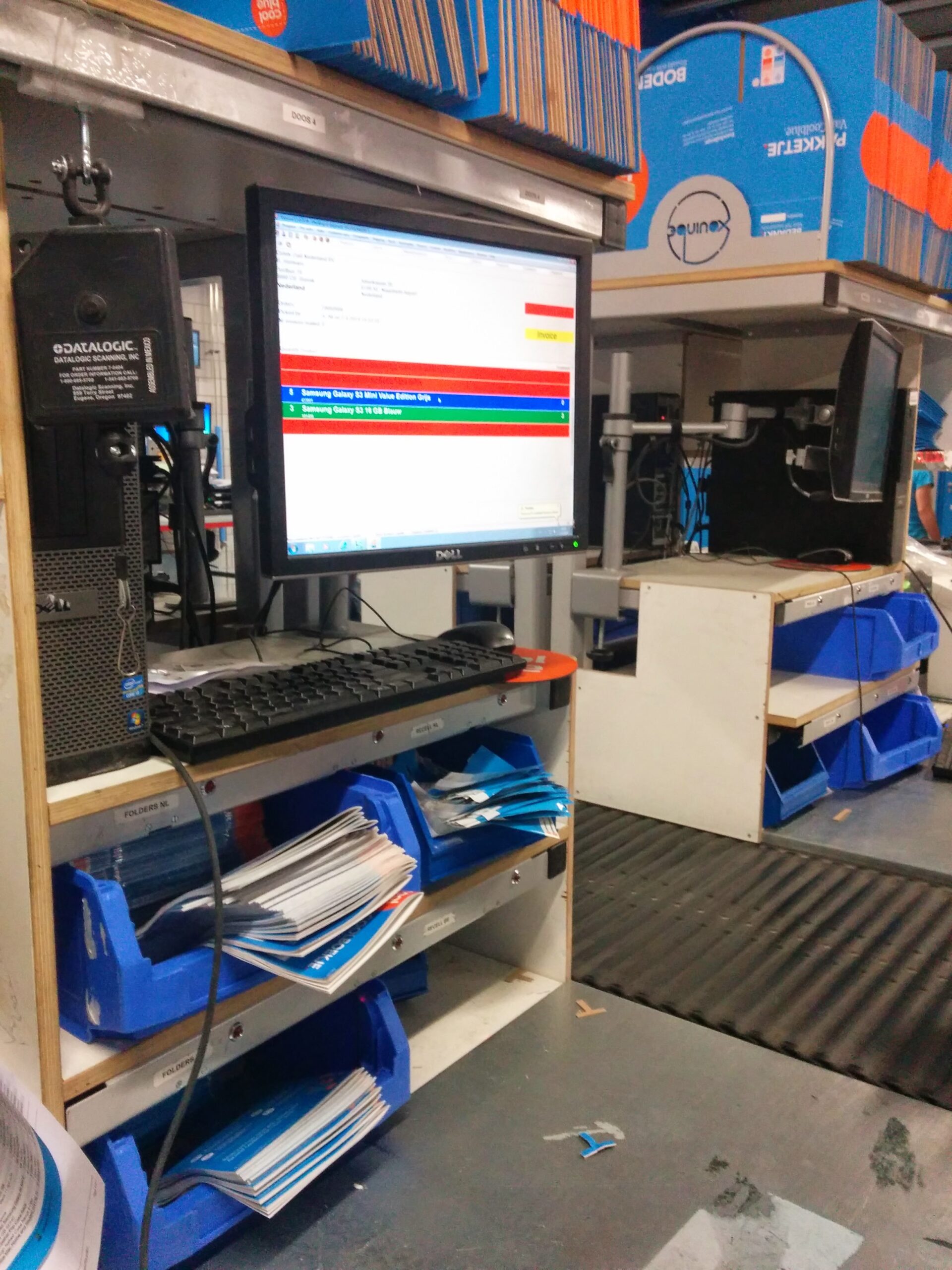
Usage of old app in logistics
Part of the fulfilment process.
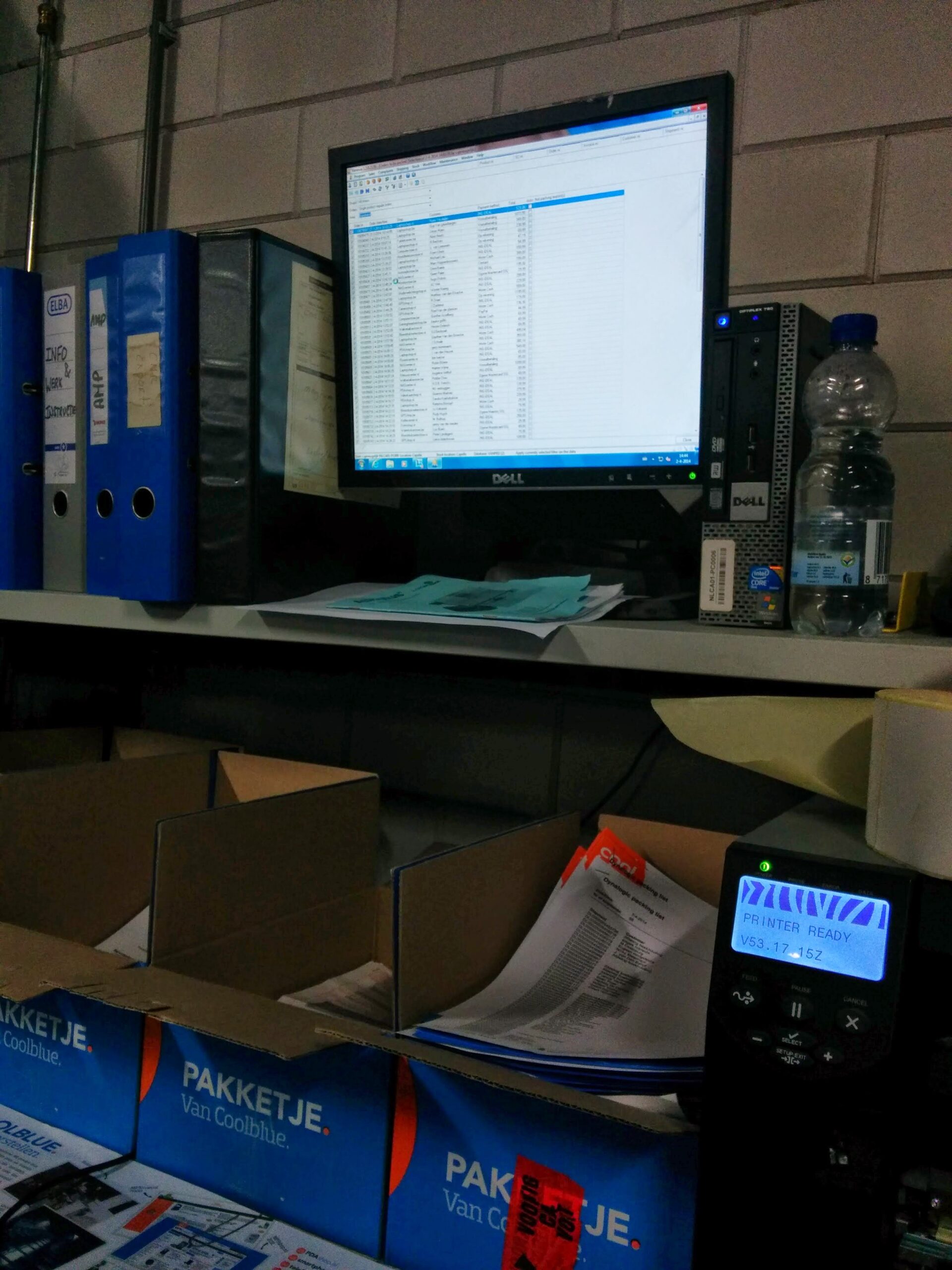
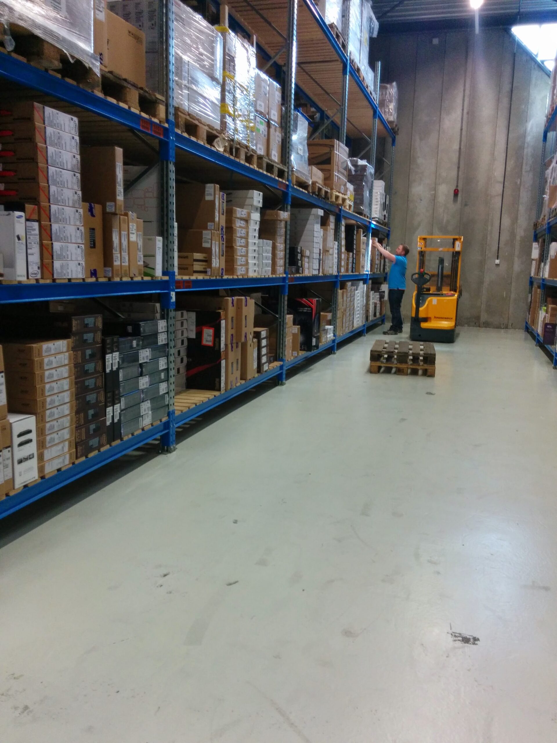
Logistics using restocking app
Part of the fulfilment process.
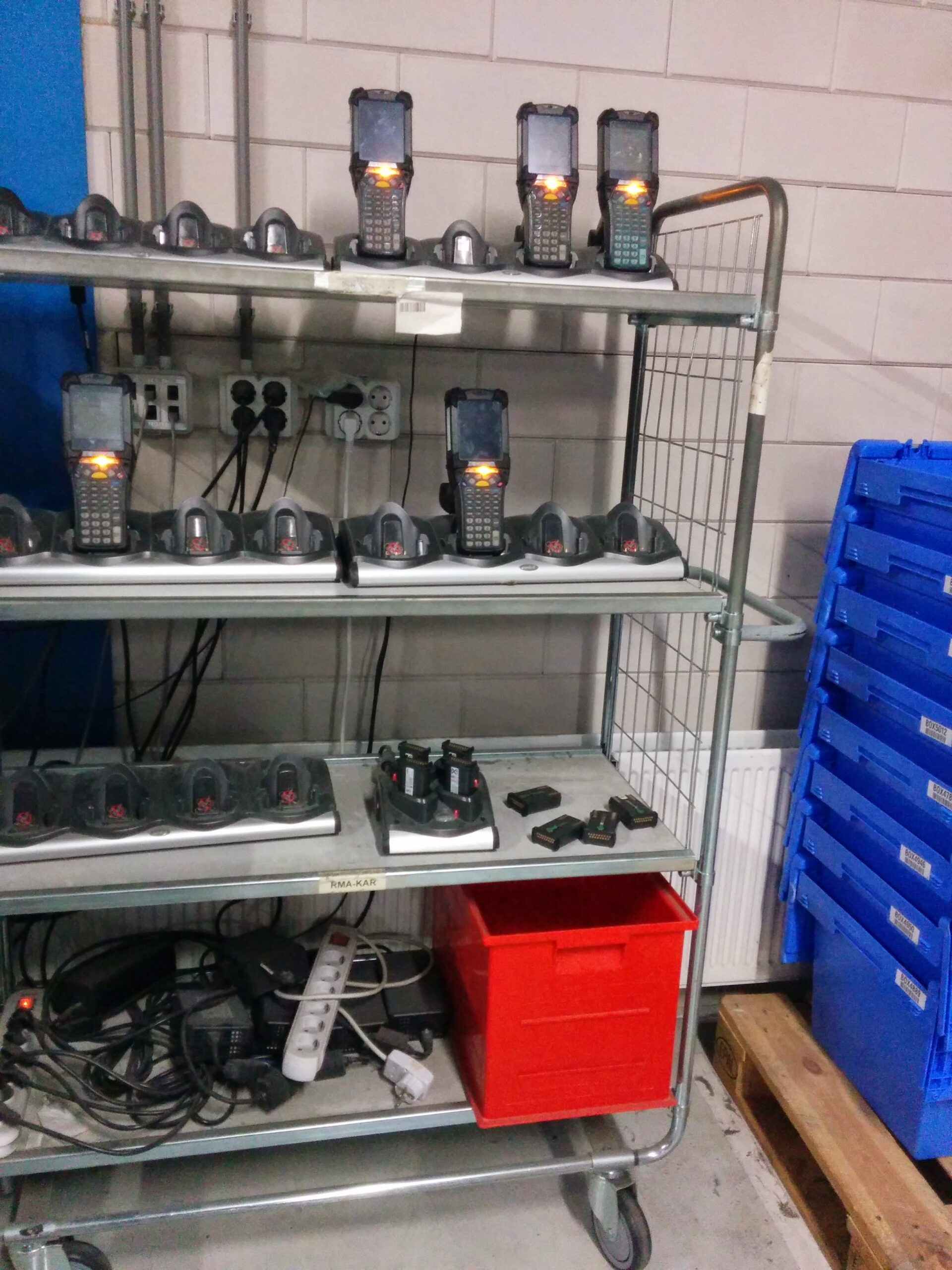
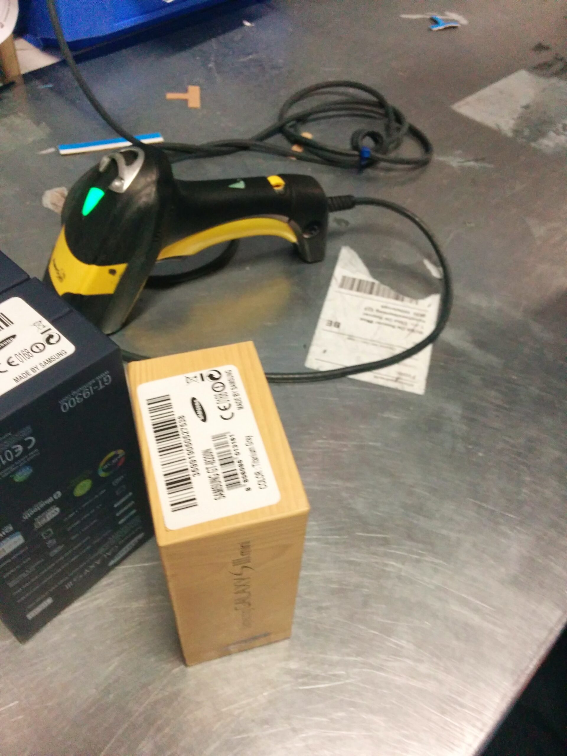
Scanners for tracking in warehouse
Part of the sorting process.
Products in their primary packaging
Part of the sorting process.
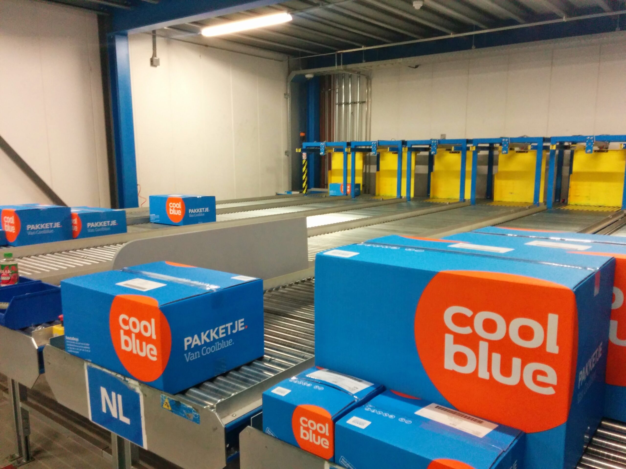
Outgoing products being scanned and confirmed
Part of the packaging process.
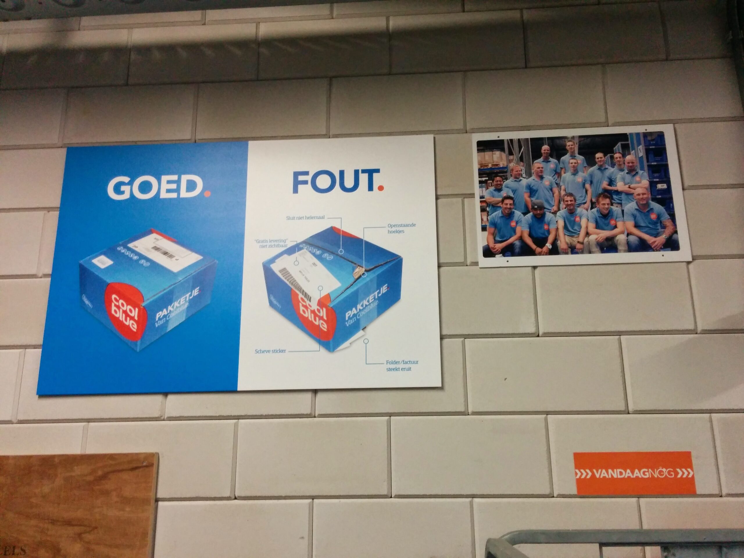
Packaging guidelines
Part of the packaging process.
Parcels ready to be loaded
Part of the delivery process.
Parcels readied for delivery
Part of the delivery process.
3. Ideation sessions
Through collaborative brainstorming sessions, facilitated by the product owner, we identified the potential to automate many of the restocking decisions while reserving complex tasks for buyers. These discussions also highlighted the critical role of the restocking process within Coolblue’s overall operations.
3.1. Mapping the old process
To effectively design the product, we focused on understanding the interactions between users and both physical and digital systems across different business areas. I created a visual sequence to illustrate the steps a buyer would take to decide whether to restock a particular product.

Buyers checking necessary data points
Using these visual representations, buyers could assess whether a product warranted further investigation for restocking. Buyers often relied on their own tools, such as spreadsheets, to generate additional data points. Additionally, a shared wiki served as a resource for navigating the restocking process.
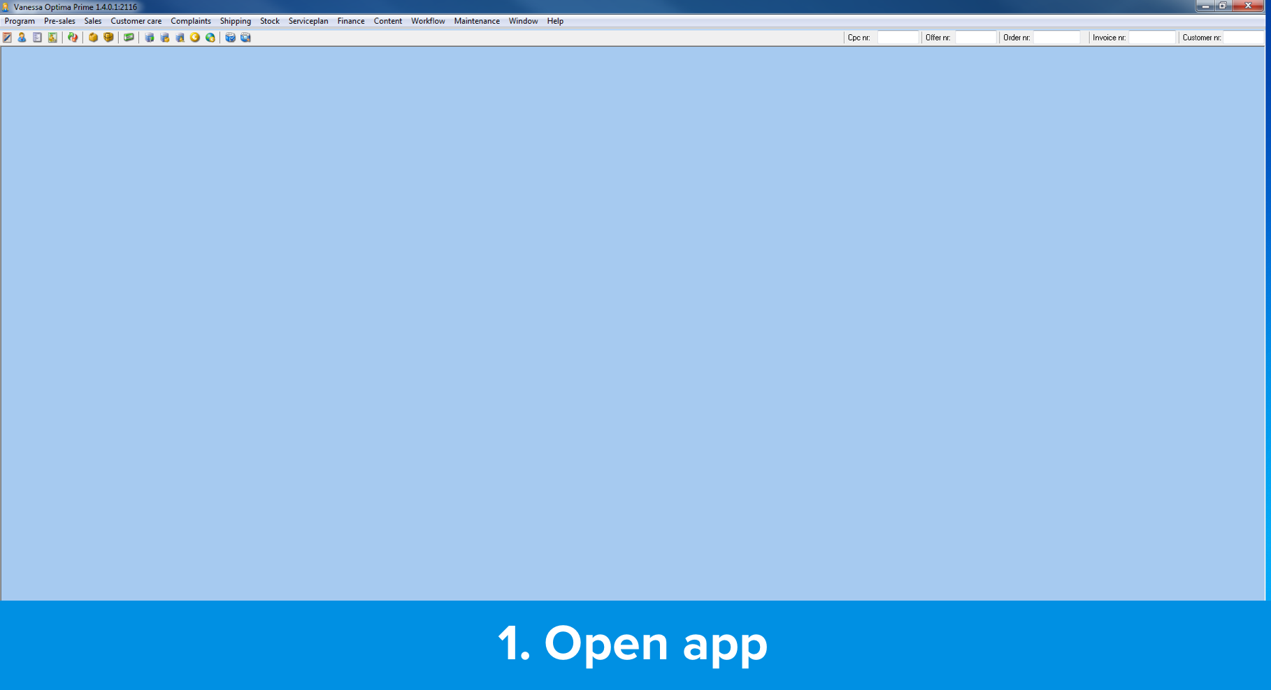
Step 1: Open old app
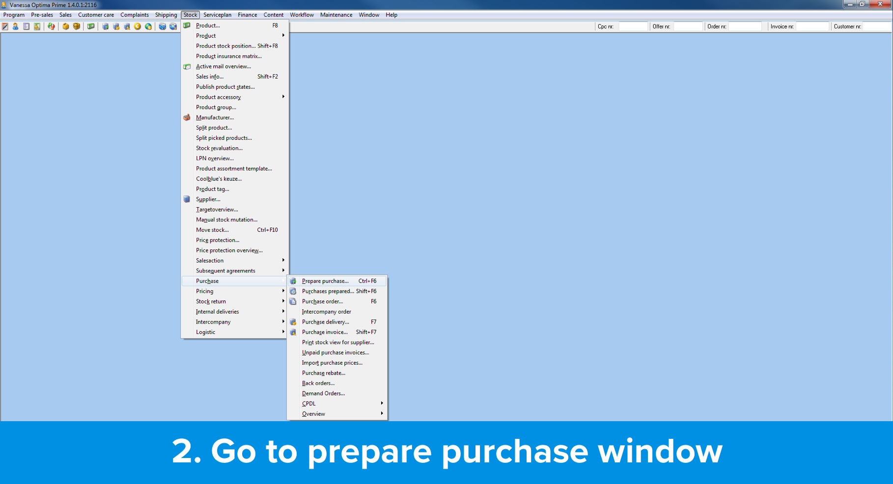
Step 2: Go to restocking window
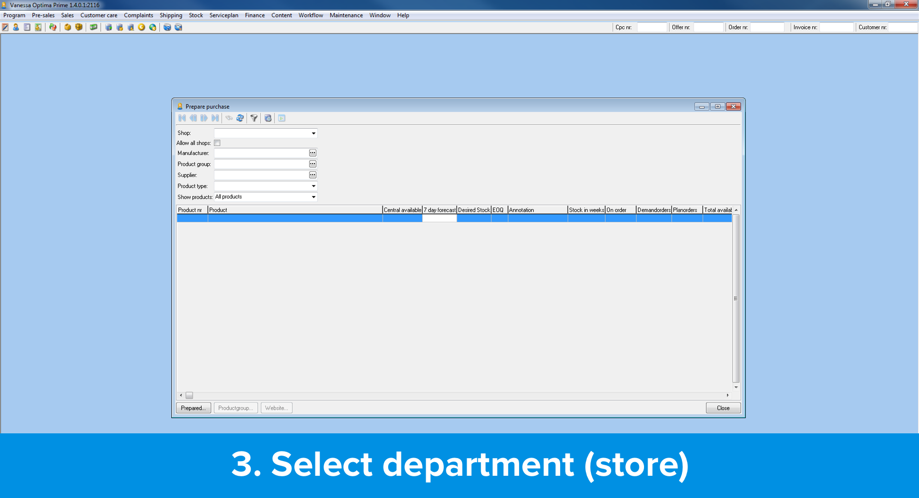
Step 3: Fill shop
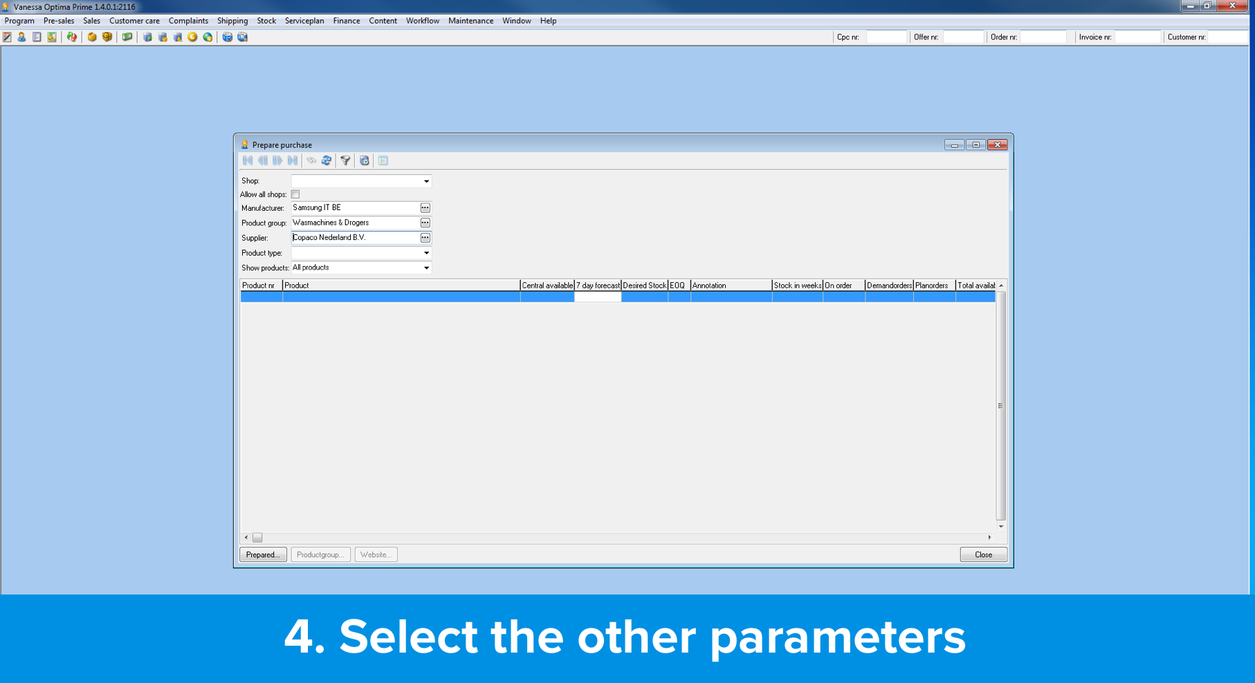
Step 4: Fill other parameters
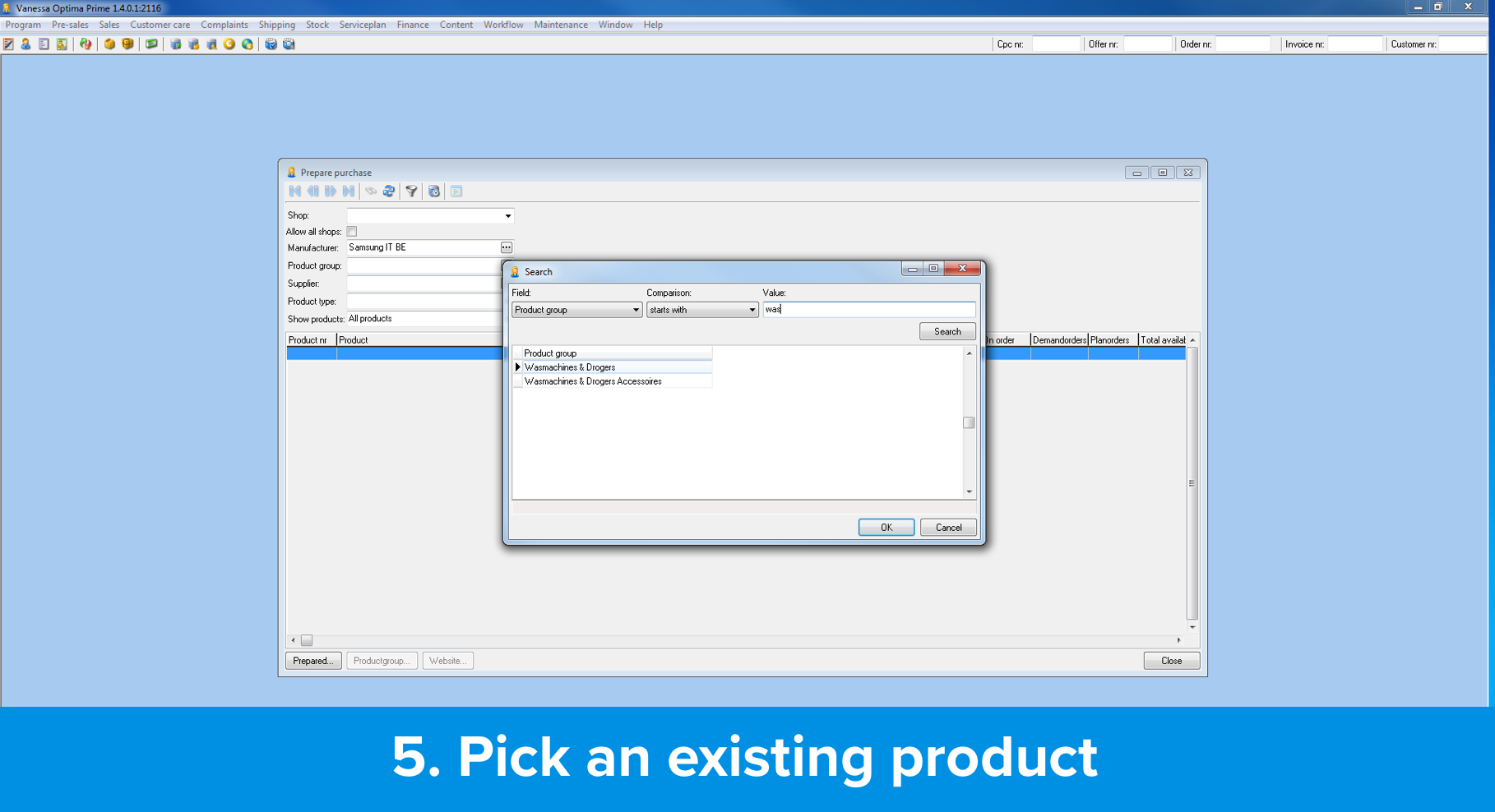
Step 5: Select product
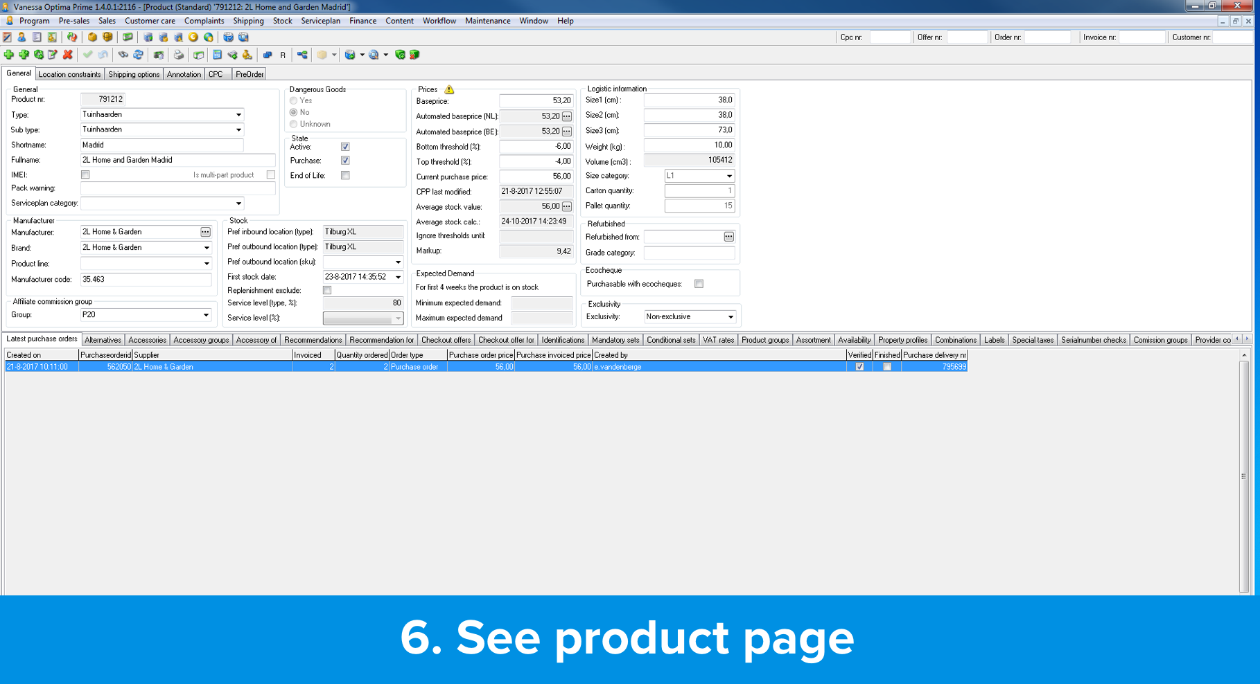
Step 6: Load product page
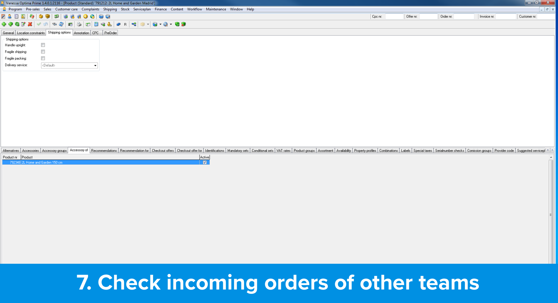
Step 7: See outstanding orders
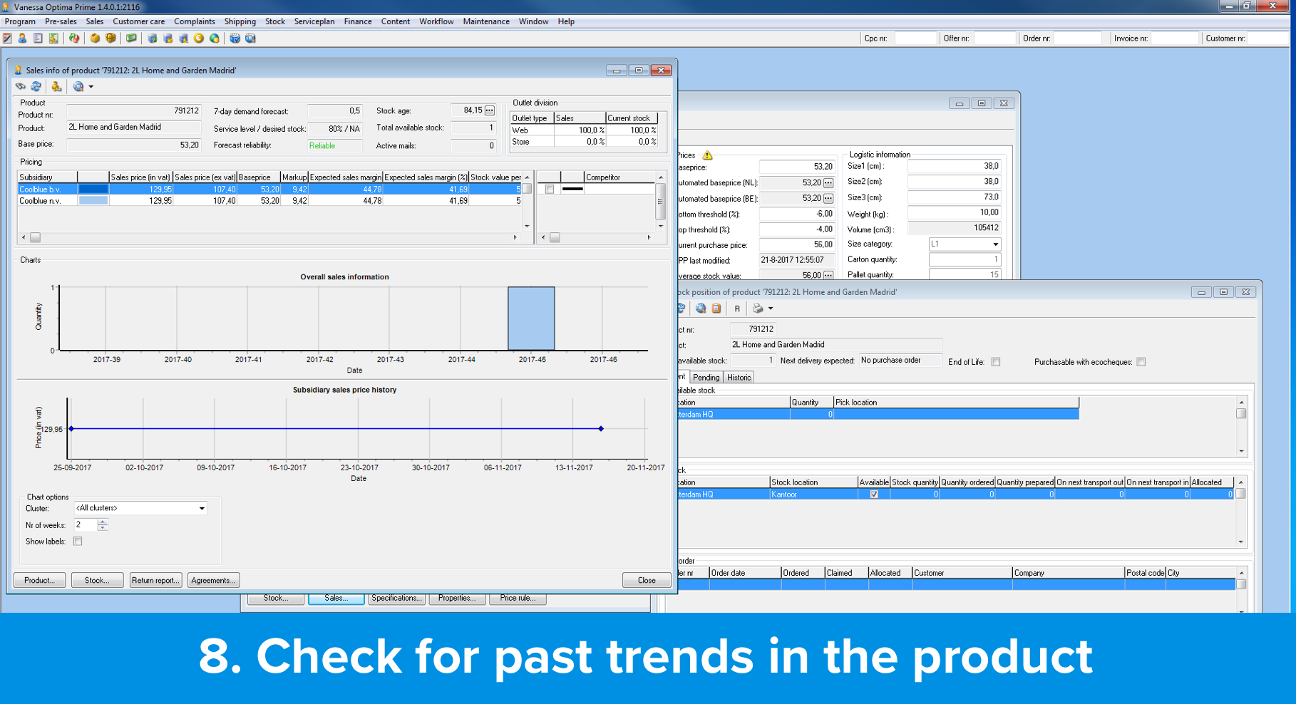
Step 8: Check product trends
4. Wireframing
I created the initial wireframes outlining the tool’s workflow. Under pressure from the CEO, we were tasked with designing a tool that was incredibly user-friendly, even to the point of being controllable with an Xbox gamepad. While I initially interpreted this as a metaphor for simplicity, it became evident that Xbox controller compatibility was a genuine requirement.
Despite this, I ensured that the tool remained office-friendly, functioning seamlessly with a keyboard and mouse.

Early concept (pre-feedback)
This early concept was done to place the ideas of the ideation sessions.

Late concept with feedback
After gathering feedback from stakeholders and key users, I refined the concept through sketching and prototyping until I was satisfied with the high-fidelity design.
5. Guerilla testing
Testing with the end-users was straightforward in this case. Simply sharing a link to the InVision prototype allowed them to walk through the design. I carefully documented their feedback and presented it to the team for analysis.
6. Hi-fidelity prototyping
The tool was designed for simplicity, focusing on a single decision at a time. Our goal was to provide buyers with the most relevant information to facilitate quick and accurate restocking decisions.
The tool would automatically identify items needing restocking, and buyers would assess whether to restock, the quantity, and the preferred supplier (initially limited to one). After making a decision, the screen would update, and the process would continue until all restocking needs for the day were addressed.
Main restocking screen
The tool was designed as a single-page application, intended for general users. This screen would repeat as needed to process the queue of low-stock products.

User management screen
This section of the application was restricted to employees with specific privileges, allowing them to create new buyer accounts and assign them to appropriate teams.

Tasks to resolve today
This screen was designed to provide buyers with a clear overview of their daily restocking tasks, ensuring that the team relying on their decisions remains on schedule.
7. Probing after release
Following each sprint, I conducted feedback sessions with buyers to gather insights for product improvement. After several iterations, we invited buyers to our team room for a demonstration of the application (Vanessa Purchandez). This hands-on session allowed buyers to interact with the app, share their experiences, and ask questions directly to the development team.
8. Demo
During each sprint, we held demos attended by buyers and other stakeholders. These sessions served two key purposes: to showcase new app features and discuss progress toward our key performance indicators.
Conclussion
Results
Buyers now make restocking decisions in our app in just 1-3 minutes, a significant improvement from the previous 30-45 minutes (self-reported).
Buyers reported using the app for approximately 50-60 minutes daily, with variations based on the number of purchase decisions made.
Over a six-month period, product availability across the entire portfolio increased by 36%, including automated orders.
While we did not track overstocking specifically, we were unable to identify any noticeable changes in buyer behavior related to excess inventory through our communications with logistics employees.
Learnings
We learnt that the philosophy of making it so simple that you could control the app with a gamepad was the way to go. But making it compatible with a gamepad was not necessary. Unfortunately, there were external pressures that lead us there despite our best efforts.
Implementing automation is challenging, especially when dealing with external dependencies. The process can be slow and often imperceptible to end-users. While we successfully automated nearly a quarter of the portfolio, the lengthy implementation time proved frustrating for many.
The shipping industry, as a whole, lags behind technologically and often exhibits reluctance to share data. Internal bureaucratic challenges within Coolblue and with suppliers, coupled with inadequate past agreements, hindered our progress. Direct engagement with external parties proved to be a valuable asset.
While presenting tasks individually had a strong theoretical foundation, our buyers quickly discovered that this approach hindered their sense of control. To enhance the user experience, the screen needed to be redesigned to allow for multiple decisions to be made simultaneously or in real time.
Looking for me on LinkedIn?
Get to know me
Let's work together
I live and work in the Randstad area of the Netherlands (Amsterdam, Rotterdam, Utrecht, The Hague, Leiden, Delft, Harlem, etc).
For the SEO optimization guys. Thank you for your offers. But I am not interested in your services. This is a personal portfolio. I do not seek to have millions of visitors.